Logo and Side Nav

News

Velit dreamcatcher cardigan anim, kitsch Godard occupy art party PBR. Ex cornhole mustache cliche. Anim proident accusamus tofu. Helvetica cillum labore quis magna, try-hard chia literally street art kale chips aliquip American Apparel.

Search

Browse News Archive

publications:

Showing posts with label publications. Show all posts

Friday, February 28, 2014

Gender, age, and ambiguity of selfies on Instagram

Gender and Age Distributions of Selfies


selfiecity.net research update by Mehrdad Yazdani, Research Scientist, Software Studies Initiative.


Who are the people behind selfies? Are they mostly young? Do women prefer taking selfies over men? Do these variations depend on geographic location? We looked at over 4,500 selfies from six cities to gain a sense of the different age groups and genders. (Analysis and visualizations of our findings for 3200 images from five cities from this dataset are available on selfiecity.net.)

We did this by first downloading a random sample of 140,000 images among all Instagram photos shared by people in central areas of 6 global cities for one whole week (Dec 4-12, 2013). Our random sample of Instagram photographs include:

  • 30,000 images from Tokyo
  • 30,000 images from New York
  • 20,000 images from Bangkok
  • 20,000 images from Berlin
  • 20,000 images from Moscow
  • 20,000 images from Sao Paulo
Now we have to figure out which of these images are actual selfies. We define the selfie as a photograph that you take of yourself. Since this definition can lead to a great deal of ambiguity, we ask several people to gain a better consensus. We utilize Amazon's Mechanical Turk service to find human reviewers (who are payed!) to review each image. At least 3 reviewers review each of the 140,000 images to find all the selfies. Obviously, in some cases, the reviewers disagree if an image is a genuine selfie or not. To resolve these disagreements, we use a simple majority vote (the mode of votes in statistics jargon) to make the final call as to whether the image is a selfie or not.

plot of chunk unnamed-chunk-2

What you see above is what we call the "selfie rate," that is, the percentage of selfies that our reviewers from Mechanical Turk found from the 140,000 images that we collected. What is most striking about this figure is that, in contrast to popular belief, the selfie is not ubiquitously plastered all over Instagram. In fact, Sao Paulo has a selfie rate clocking in at just under 5%! Tokyo, on the other hand, has an even significantly lower selfie rate of a hair above 1%.

But we don't stop at just finding selfies from our set of images. If a reviewer thinks that the image is indeed a selfie, he or she also takes a best guess at the gender and age of the selfie. Again, these are reviewers who use Mechanical Turk on a regular basis and therefore asking them to complete an image-tagging problem is on-par with their expertise. The graph above shows that the gender distribution of the selfies is heavily skewed towards females. Moscow in particular has a large disproportionate amount of female selfies. In fact, it is 4 times less likely that a selfie from Moscow is male (with a 95% confidence interval between 3.3 and 5.3).

However, it is not fair to assume that gender is a binary factor that we can neatly divide into "male" or "female." Would it be possible for us to have a way of measuring the ambiguity of a selfie's gender? Answering such a question is extremely difficult, but let's take a data science approach (read: hack). We will make an assumption that if it is difficult to ascertain a selfie's gender as "male" or "female" then our reviewers from Mechanical Turk will have a harder time making a decision. Since we have multiple reviewers (at least 3 or more), then there will be more disagreements if it is truly difficult for the reviewers to determine the selfie's gender. Let's assign a confidence score between 0 and 1 to the collective agreement of the reviewers for the gender of the selfie. What follows are the averages of gender discrimination confidence for the different cities:

plot of chunk unnamed-chunk-3

We see some very interesting patterns emerging from this figure. Over the entire population, we see that the reviewers are fairly confident (over 95%) of a selfie's gender. However, consistently for every city, the average gender confidence for males is less than those of females. In the case of Berlin, this difference may very well be insignificant and due to chance, but for the other cities we see much wider gap in confidence. Especially in the case of Sao Paulo and Moscow, the reviewers are much more confident at detecting females than the other cities. One possible interpretation: What makes these cities unique is that women in these cities are unquestionably "female looking" (at least when they take their selfies and post them), so the confidence reviewers have for these female selfies is higher.

We next take a look at the age distributions of the selfies. Here they are organized by city and gender:

plot of chunk unnamed-chunk-4

The most dramatic result here is that for every city we see that men who take selfies are older than their female counterparts. Bangkok has the youngest selfie enthusiasts, while New Yorkers have the oldest. If we look on a log-scale, as the age of a selfie increases, the odds of the selfie being male increases by a factor of 6.7 (with a 95% confidence interval between 4.99 and 9.03). Overall, however, the early twenty somethings dominate selfies on Instagram. As before, we determine the age of the selfie by asking several reviewers to make their best guess. We then estimate the age of the selfie by taking the median of the guesses of the reviewers. As in the case for determining gender, this can be a very difficult task and certain selfies can be harder to answer. To ascertain the agreement level for a selfies age, we computed the standard deviation of the reviewers guesses. In this case, higher standard deviation suggests more disagreement among the reviewers. We refer to this standard deviation as the "disagreement." Below we show average disagreements for each city and gender:

plot of chunk unnamed-chunk-5

With the exception of Berlin and New York (that have the highest disagreements), female age discrimination has the least amount of disagreement. The difference between the disagreement levels of males and females in Berlin does not appear to be significant. By far, Bangkok has the least amount of disagreement for age discrimination of female selfies among all cities. It is difficult to ascertain why this is the case. We welcome any hypotheses for this finding!

In summary, our study suggests that selfies are not the dominant imagery shared on Instagram. We have also observed that the selfies are extremely popular by females and twenty somethings. We are planning more posts on softwarestudies.com about additional details and more results from selfiecity.net research, so check back to see them.

Tuesday, February 11, 2014

An Outline for Computational Art History


The Hawaiian Star, 5930 front pages, 1893-1912 (Vimeo). Created by UCSD undergraduate student Cyrus Kiani in Manovich's visualization class, 2012.


An Outline for Computational Art History


Computational art history - use of algorithms for the analysis and visualization of patterns in art production, dissemination, reception/interaction, and scholarship. (In other words: use of computers to augment human intellect and intuition.)


Three complementary ways to think about research projects and methods in computational art history:


1 | Which stage(s) in art circulation process do you want to analyze?
- production [example 1, example 2]
- dissemination [example]
- reception (visitors movements in a museum, user tags, professional art criticism publication, user searches, etc.) [example]
- user interaction with digital media [many possibilities for capturing data about the experience; the work is co-created by software and participant]
- institutions / exhibitions / collecting / publications / art sales / art world system [example 1, example 2]
- scholarship

and also:
influence [example]
artists networks [example]
interactions with other cultural areas
etc.


2 | What data types you want to analyze?
structured, unstructured
text, images, video, 3D shapes, spaces, networks of relations, geospatial data, movements capture, interactions capture


3 | Which stage(s) in data analysis workflow you will work on?
- acquire and clean data (media agnostic)
- organize data for analysis (media agnostic)
- feature extraction (automatic) (media specific) / adding metadata (media agnostic)
- exploratory visualization (media agnostic)
[however images and video allow for unique visualization techniques: example 1, example 2]
- (optional) data analysis using classical statistics and/or data science methods (media agnostic)


Lev Manovich, february 11, 2014.

Sunday, January 26, 2014

"Software, Globalization and Political Action" course co-taught by Manovich and Buck-Morss, Spring 2014, Graduate Center CUNY


#softclassgc (class Twitter hashtag)


SYLLABUS (Google Doc updated throughout the semester - we suggest you check it every weekend to see the updates)


Readings (Dropbox)


Locals and Tourists #2 (GTWA #1): New York

Top: a frame from A Man with a Movie Camera by Dziga Vertov, 1929.
Bottom: Visualization of locations of large number of photos in NYC shared on Flickr, from "Locals and Tourists" by Erik Fisher, 2009).


Spring 2013 course: Software, Globalization, and Political Action

Co-taught by Susan Buck-Morss (Political Science) and Lev Manovich (Computer Science). The Graduate Center, City University of New York (CUNY)

Tuesdays 2-4pm.
4 Credits. Cross-listed in the Programs in Political Science, Computer Science and Art History.


Description:

This interdisciplinary seminar will explore concepts and methods from both critical theory and software studies. It is taught by Prof. Susan Buck-Morss (Political Science), and Prof. Lev Manovich (Computer Science).

We will cover three themes:

1) Vision and Image - From Walter Benjamin and Dziga Vertov to computer vision, Google Earth, Adobe Creative Suite, and Instagram: new strategies of seeing and representation in modern and software societies. Image v. Concept (Hegel against ‘picture thinking’) Image and historical matter (Benjamin on the “dialectical image”). Aesthetics and Politics: Images as a (trans-local) language for political action; vision and democracy: the “ethical turn.” Digital Image Processing and Computer Vision and examples of their application in creative industries, vernacular digital photography, and digital humanities.

2) Data and Knowledge - Knowledge production in the age of "big data." Images as sources of knowledge. Political critique of methods (positivism, abstraction, categorical givens) and goals (surveillance, marketing, positivism). Knowledge of, by and for whom? Data science as the new key technology for production of knowledge and decision making in big data societies. Data visualization as a research method in humanities and social sciences (including art history and political science). From representing reality to representing data. Data art.

3) Crowds and Networks - What are the new forms of sociality and political action enabled by global networks? Networked Images as political instruments. Crowds and the de-centered brain. Crowds and/as a medium of global political action since the Arab Spring. The new body politic as a body without skin. Social networks and computational social science. Social media analytics. Artistic visualizations of social data.


Wednesday, January 1, 2014

Looking back: 2013 publications and projects from Software Studies Initiative


Projects:

Phototrails: Analysis and visualization of 2.3 million Instagram photos shared by people in 13 global cities. Released 7/1/2013. Team: Nadav Hochman, Lev Manovich, Jay Chow.


Exhibitions:

The Aggregate Eye: 13 cities / 312,694 people / 2,353,017 photos. Amelie A. Wallace Gallery, October 29 – December 5, 2013. Artists: Nadav Hochman, Lev Manovich, Jay Chow. Curators: Hyewon Yi and Alise Tifentale.


Books:

Manovich, Lev. Software Takes Command. Bloomsbury Academic, published 7/4/2013. 100,000 words.


Articles and book chapters (13):


Akdag Salah, A.A., L. Manovich, A.A. Salah and J. Chow, "Combining Cultural Analytics and Networks Analysis: Studying a Social Network Site with User-Generated Content." Journal of Broadcasting and Electronic Media, Volume 57, Issue 3, pp. 409-426, 2013.

Hochman, Nadav and Lev Manovich. Visualizing Spatio-Temporal Social Patterns in Instagram Photos. In proceedings of the GeoHCI Workshop in conjunction with ACM CHI 2013. Paris, France, April 2013.

Hochman, Nadav and Manovich, Lev. Zooming into an Instagram City: Reading the local through social media. First Monday, 6/1/2013.

Adelheid Heftberger. "Das Potential der reduktionslosen Visualisierung am Beispiel von DAS ELFTE JAHR und DER MANN MIT DER KAMERA von Dziga Vertov." Chronos-Verlag, Geschichte und Informatik (forthcoming 2014).

Navas, Eduardo. Modular Complexity and Remix: The Collapse of Time and Space into Search. Published in AnthroVision 1.1 (2012); released on softwarestudies.com on 4/19/2013.

Manovich, Lev. Museum Without Walls, Art History without Names: Visualization Methods for Humanities and Media Studies. Oxford Handbook of Sound and Image in Digital Media, edited by Carol Vernallis, Amy Herzog, and John Richardson (Oxford University Press, 2013).

Manovich, Lev. Media Visualization: Visual Techniques for Exploring Large Media Collections. The International Encyclopedia of Media Studies, Volume VI: Media Studies Futures, ed. Kelly Gates, (Blackwell, 2013).

Manovich, Lev. Visualing Vertov. First part published in Russian Journal of Communication (Taylor & Francis); second part to appear in Cinematicity, eds. Jeff Geiger and Karin Littau (Edinburgh University Press). 1/11/2013.

Manovich, Lev. The Language of Media Software. 2/18/2013. Forthcoming in The App Book, eds. Svitlana Matviyenko and Paul Miller (The MIT Press, forthcoming 2014).

Manovich, Lev. Media After Software. Journal of Visual Culture. 4/5/2013.

Manovich, Lev. Visualizing Social Photography. 11/2013. Forthcoming in Aperture #214, winter 2014.

Manovich, Lev. Software is The Message. 12/2013. Forthcoming in Journal of Visual Culture, spring 2014.

Manovich, Lev. The Algorithms of Our Lives. The Chronicle of Higher Education, 12/16/2013.


Tuesday, December 17, 2013

Visualizando fotografias sociais


3.montage_nyc_tokyo.full-size-medium


Lev Manovich, 2013.
Tradução: Cicero Inacio da Silva.


No prelo a ser publicado na revista Aperture #214 (2014). 


Neste verão o Museu de Arte Moderna de Nova Iorque (MoMA) pediu ao grupo de Estudos do Software, um programa que iniciei em 2007, para analisar como a visualização poderia ser usada como uma ferramenta de pesquisa e, talvez, como um meio para mostrar sua coleção de fotografias de maneira inovadora. Tivemos acesso a aproximadamente vinte mil fotografias digitalizadas, que combinamos em uma só imagem de super alta definição usando nosso software. Isso nos permitiu visualizar todas as imagens de uma só vez, rolando das imagens do início da mídia fotográfica até imagens registradas recentemente, abrangendo países, gêneros, técnicas e diversos aspectos da sensibilidade dos fotógrafos. Praticamente cada ícone fotográfico foi incluído - imagens que eu tinha visto repetidamente reproduzidas. Minha habilidade em facilmente poder realizar um zoom em cada imagem e estudar seus detalhes, ou diminuir o zoom para ver a imagem em sua totalidade, foi quase uma experiência religiosa. 

Observar vinte mil fotografias simultaneamente pode soar surpreendente, uma vez que até mesmo a maior galeria do museu possui, no máximo, uma centena de obras. E isso que a coleção do MoMA, usando os padrões do século XX, pode ser considerada escassa em comparação com os enormes repositórios de fotografias existentes em sites de compartilhamento de mídia, tais como Instagram, Flickr e 500px. (o Instagram sozinho já contém mais de um bilhão de fotografias, enquanto que os usuários do Facebook sobem mais de dez bilhões de imagens todos os meses). A ascenção da "fotografia social", lançada pelo Flickr em 2005, inaugurou novas possibilidades fascinantes para o campo da pesquisa cultural. A foto-universo criada por centenas de milhares de pessoas pode ser considerada como um mega-documentário, sem roteiro nem diretor, mas a escala desse documentário requer ferramentas computacionais - bases de dados, motores de busca e visualização, para que possamos assistí-lo.


Explorar (minerar) as partes constituintes desse "documentário" pode nos ensinar sobre a fotografia vernacular e hábitos que regem o desenvolvimento da imagem digital. Quando as pessoas se fotografam, será que elas privilegiam estilos de enquadramentos específicos, como os fotógrafos profissionais? Será que os turistas que visitam Nova Iorque fotografam os mesmos objetos; será que suas escolhas são culturalmente determinadas? E quando eles fotografam os mesmos objetos (por exemplo, plantas no High Line Park em Manhattan), eles usam as mesmas técnicas?

Para começar a responder a essas perguntas, podemos usar computadores para analisar os atributos visuais, os conteúdos de milhões de fotos e as descrições que as acompanham, tais como tags, coordenadas geográficas, data e hora dos uploads e, a partir daí, interpretar os resultados. Apesar dessa pesquisa só ter começado há poucos anos, já existe um número significativo de projetos interessantes que apontam para o futuro de uma "sociologia visual computacional" e de um "foto criticismo computacional".

Em 2009 David Crandall e seus colegas do Departamento de Ciência da Computação na Universidade de Cornell publicaram um artigo intitulado "Mapeando as Fotos do Mundo" (Mapping the World’s Photos), com base na análise de cerca de trinta e cinco milhões de fotografias do Flickr. Como parte da pesquisa, eles criaram um mapa constituído por todos os locais onde essas imagens foram tiradas (("world heat map"). As áreas com mais fotos parecem mais brilhantes , enquanto que aquelas com menos fotografias são mais escuras. Não é surpreendente que os Estados Unidos e a Europa Ocidental estão bem iluminados, enquanto que o resto do mundo permanece na escuridão, indicando uma cobertura mais esporádica. Mas o mapa também revela alguns padrões inesperados - as linhas costeiras da maioria dos continentes são muito brilhantes, enquanto os interiores dos continentes, com as notórias exceções ​​dos Estados Unidos e da Europa Ocidental, permanecem completamente no escuro.

Crandall e sua equipe, usando o conjunto de fotos coletadas, também determinaram os locais mais fotografados em vinte e cinco áreas metropolitanas. Isso os levou a novas descobertas - o quinto local mais fotografado de Nova York foi a loja da Apple no centro; A Tate Modern foi classificada como número dois em Londres.

O projeto de foto-mapeamento Locals and Tourists, criado em 2010 pelo artista de dados e desenvolvedor de software Eric Fisher, focou em uma pergunta, provavelmente motivada por tais informações: quantas dessas imagens foram capturadas por turistas ou moradores locais, e como que essa diferenciação pode revelar diferentes padrões? O projeto "Moradores e Turistas" de Fisher apontou os locais com um grande número de fotografias no Flickr e usou cores para indicar quem as tirou: as imagens azuis foram tiradas por habitantes locais e as imagens vermelhas foram registradas por turistas. As fotos com cores amarelas podem ter sido registradas por outros grupos. No total ele mapeou 136 cidades e depois compartilhou esses mapas no Flickr. Em seu mapa de Londres vemos como os turistas freqüentam alguns locais bem conhecidos, todos eles no centro de Londres, enquanto que os moradores locais cobrem toda a cidade, mas documentam imagens menos assiduamente.

Esses projetos pioneiros usam metadados para revelar padrões em fotografia social. Contudo, eles não usaram imagens reais em suas visualizações, uma prática explorada pela primeira vez, ao menos que eu saiba, pelo artista James Salavon. Para projetos como Every Playboy Centerfold, 1988–1997 e Homes for Sale, 1999-2002, Salavon fez uma composição de um número de imagens para revelar as convenções fotográficas utilizadas para representar assuntos específicos. Seu trabalho mais recente, Good and Evil '12, 2012, é composto por dois painéis, cada um mostrando cerca de vinte e cinco mil fotografias resultantes das buscas realizadas no Bing das cem palavras mais positivas ou negativas em Inglês.

Os mídia artistas como Salavon demonstram como a visualização pode revelar padrões no conteúdo de coleções de imagens de grandes dimensões. Em 2007 montei um laboratório de pesquisa para explorar ainda mais essas ideias e desenvolver ferramentas de visualização de código aberto que podem ser usadas por quem trabalha com historiadores da arte, imagens, estudiosos de cinema, mídia e curadores. Uma das nossas ferramentas de software pode analisar as propriedades visuais (como contraste, tons de cinza , textura, cores dominantes , orientações de linha) e algumas dimensões do conteúdo (presença e posição dos rostos e corpos) em qualquer número de imagens. Outra ferramenta pode utilizar os resultados desta análise para posicionar todas as imagens em uma única visualização de alta resolução ordenada por suas propriedades e metadados. Nós usamos essas ferramentas para visualizar uma variedade de coleções de imagens, que vão de cada uma das capas da revista Time entre 1923 e 2009, num total de 4.535 capas, até um milhão de páginas de mangá.

Em nosso projeto recente, Phototrails, o doutorando em História da Arte Nadav Hochman, o designer/ programador Jay Chow e eu começamos a explorar padrões em fotos enviadas para sites de mídia social. Na primeira fase do projeto, baixamos e analisamos 2,3 milhões de fotos do Instagram advindas de treze cidades globais. Uma das nossas visualizações mostra 53.498 fotos compartilhadas por pessoas em Tóquio durante alguns dias consecutivos. A progressão das atividades dominantes das pessoas ao longo de um dia de trabalho, jantando, saindo - reflete-se na mudança de cores e brilho das imagens. Nenhum dia é igual. Alguns são mais curtos do que os outros, ou a progressão entre as diferentes actividades é muito gradual, enquanto que em outros é mais nítida. Juntas, essas fotos criam um "documentário agregado" de Tokio - um retrato da mudança dos padrões temporais da cidade que foram reunidos a partir de milhares de atividades documentadas .

Mas os documentários a partir de um conjunto de imagens são algo novo? O documentário experimental Um Homem com uma câmera (1929) de Dziga Vertov, que retrata um dia na vida de uma cidade soviética, pode ser considerado um precursor dessa forma. O filme combina filmagens realizadas em três cidades ucranianas - Odessa, Khartiv e Kiev - ao longo de um período de três anos. Vertov queria comunicar ideias particulares, como a construção de uma sociedade comunista que orientou a seleção e edição de sua filmagem.

Nossas visualizações de hábitos humanos renderizados por meio de fotografias advindas do Instagram não refletem somente um único ponto de vista. Mesmo assim, elas são tão subjetivas quanto as mais tradicionais fotografias. Assim como um fotógrafo decide sobre o enquadramento e a perspectiva, nós tomamos decisões formais sobre como mapear as imagens, organizá-las por datas de upload, ou cor, ou brilho e assim por diante. Mas, visualizando o mesmo conjunto de imagens de várias maneiras (veja aqui um exemplo que usa uma coleção de obras de arte de Mark Rothko), lembramos que nenhuma visualização oferece uma interpretação objetiva, assim como nenhuma imagem documental única e tradicional jamais poderia ser considerada neutra,  ao invés disso, a diversidade das fotografias do Instagram destacam a variedade de padrões complexos de vida que se desdobram em cidades que nunca podem ser de forma total visualmente capturadas em uma única visualização, apesar da nossa capacidade de usar milhões de fotos do Instagram.

( Novembro, 2013)


"Software is the Message" - new mini article (1000 words) from Lev Manovich


Software is the Message

Lev Manovich. 2013.

Forthcoming in Journal of Visual Culture, special issue "Marshall McLuhan's Understanding Media: The Extensions of Man @ 50" (Spring 2014).

(Note: Some parts of this text come from my book Software Takes Command, Bloomsbury Academic, 2013.)


Did Marshall McLuhan “miss” computers? In his major work, Understanding Media: The Extensions of Man (1964) the word “computer” appears 21 times in the book, and a few of those references are to “computer age.” However, despite these references, his awareness of computers did not have significant effect on his thinking. The book contains two dozens chapters each devoted to a particular medium—which for McLuhan range from writing and roads to cars and television. (The last chapter “Automation” addresses the role of computers for industrial control, but not its other roles).

The reasons for this omission are not hard to understand. McLuhan’s theories were focused on the media that were widely employed by regular people in human history. In 1964, the popular media for representation and communication did not yet include computers. Although by the end of the 1960s computer systems for design, drawing, animation, word processing were also developed (along with the first compute network that eventually became the Internet), these systems were only used by small communities of scientists and professionals. Only after the introduction of a PC in 1981, these inventions started to be disseminated to the masses.

As a result, software has emerged as the main new media form of out time. (I say “software” rather than “digital computers” because the latter are used to do everything in our society, and often their use does not involve software visible to the ordinary users – like the systems inside a car.) Outside of certain cultural areas such as crafts and fine art, software has replaced a diverse array of physical, mechanical, and electronic technologies used before the twenty-first century to create, store, distribute and access cultural artifacts, and communicate with other people. When you write an article in Word, you are using software. When you are composing a blog post in Blogger or WordPress, you are using software. When you tweet, post messages on Facebook, search through billions of videos on YouTube, or read texts on Scribd, you are using software (specifically, its category referred to as “web applications” or “webware”—software which is accessed via web browsers and which resides on the servers).

McLuhan’s theories covered the key “new media” of his time – television, newspapers and magazines with color photos, advertising, and cinema. Just as these mediums, software medium took decades to develop and mature to the point where it dominates our cultural landscape. How does the use of professional media authoring applications influences contemporary visual imagination? How does the software offered by social media services such as Instagram shapes the images people capture and share? How do particular algorithms used by Facebook to decide what updates from our friends to show in our News Feed shape how we understand the world? More generally, what does it mean to live in “software society”?

In 2002, I was in Cologne, Germany, and I went into the best bookstore in the city devoted to humanities and arts titles. Its new media section contained hundreds of titles. However, not a single book was devoted to the key driver of the “computer age”: software. I started going through indexes of book after book: None of them had the word “software” either. How was that possible? Today, thanks to efforts of my colleagues in the new academic field of “software studies,” the situation is gradually improving. However, when I looked at indexes of works of key media theorists of our time published in the last year, I still did not find entry for “software.” Software as a theoretical category is still invisible to most academics, artists, and cultural professionals interested in IT and its cultural and social effects.

Software is the interface to our imagination and the world—a universal language through which the world speaks, and a universal engine on which the world runs. Another term that we can use in thinking about software is that of a dimension (think of three dimensions that we use to define space). We can say that at the end of the twentieth century humans have added a fundamentally new dimension to everything that counts as “culture — that of software.

Why this conceptualization is useful? “Cultural software” is not simply a new object—no matter how large and important—which has been dropped into the space which we call “culture.” And while we can certainly study “the culture of software”—programming practices, values and ideologies of programmers and software companies, the cultures of Silicon Valley and Bangalore, etc.—if we only do this, we will miss the real importance of software. Like the alphabet, mathematics, printing press, combustion engine, electricity, and integrated circuits, software re-adjusts and re-shapes everything it is applied to—or at least, it has a potential to do this. Just as adding a new dimension adds a new coordinate to every point in space, “adding” software to culture changes the identity of everything that a culture is made from. In this respect, software is a perfect example of what McLuhan meant when he wrote that the “message of any medium or technology is the change of scale or pace or pattern that it introduces into human affairs.”

However, the development and current hegemony of software does not simply perfectly illustrate the points McLuhan made 50 years ago. It also challenges these ideas. Here is how.

In the first few decades, writing new software was the domain of professionals. However, already in the 1960s Ted Nelson and Alan Kay proposed that computers could become a new kind of cultural medium. In their paradigm, the designers would create programming tools, and the users would invent new media using these tools. According, Alan Kay called computers the first metamedium whose content is “a wide range of already-existing and not-yet-invented media.”

This paradigm had far-reaching consequences for how software medium functions today. Once computers and programming were democratized enough, some of the most creative people of our time started to focus on creating these new structures and techniques rather than using the existing ones to make “content.” During the 2000, extending the computer metamedium by writing new software, plugins, programming libraries and other tools became the new cutting-edge type of cultural activity.

For example, GitHub, a popular platform for sharing and developing open source tools, houses hundreds of thousands of software projects. Making new software tools is central for the fields of digital humanities and software art. And certainly, the key “media companies” of our time such as Google, Facebook, or Instagram do not create content. Instead they constantly refine and expand their software tools used by hundreds of millions of people to make content and to communicate.

Thus, its time to update Understanding Media. It is no longer the medium that is the message today. Instead, the software is the message. And continuously expanding what humans can express and how they can communicate is now our “content.”


Monday, December 16, 2013

"Visualizing Social Photography" - new mini-article (1000 words) from Lev Manovich


3.montage_nyc_tokyo.full-size-medium


Visualizing Social Photography

Lev Manovich. 2013.

Forthcoming in Aperture magazine #214 (2014).


This summer the Museum of Modern Art in New York asked the Software Studies Initiative, a program I started in 2007 to explore how visualization could be used as a research tool and perhaps a means to present their photography collection in a novel way. We received access to approximately twenty thousand digitized photographs, which we then combined using our software in a single very high resolution image. This allowed us to view all the images at once, scrolling from those dating from the dawn of the medium to the present, spanning in the meantime countries, genres, techniques, and photographers’ diverse sensibilities. Practically every iconic photograph was included—images I had seen reproduced repeatedly. My ability to easily zoom in on each image and study its details, or zoom out to see it in its totality, was almost a religious experience.

Looking at twenty thousand photographs simultaneously may sound amazing, since even the largest museum gallery includes about a hundred works at the most. And yet, MoMA’s collection, by twentieth-century standards, is meager compared with the massive reservoirs of photographs available on media sharing sites such as Instagram, Flickr, and 500px. (Instagram alone already contains over one billion photographs, while Facebook users upload over ten billion images every month.) The rise of “social photography,” pioneered by Flickr in 2005, has opened fascinating new possibilities for cultural research. The photo-universe created by hundreds of millions of people might be considered a mega-documentary, without a script or director, but this documentary’s scale requires computational tools—databases, search engines, visualization—in order to “watch.”

Mining the constituent parts of this “documentary” can teach us about vernacular photography and habits that govern digital image making. When people photograph one another, do they privilege particular framing styles, ala a professional photographer? Do tourists visiting New York photograph the same subjects; are their choices culturally determined? And when they do photograph the same subject (for example, plants on the High Line Park in West Manhattan), do they use the same techniques?

To begin answering these questions, we can use computers to analyze the visual attributes and content of millions of photographs and their accompanying descriptions, tags, geographical coordinates, upload dates and times, and then interpret the results. While this research only began a few years ago, there are already a number of interesting projects that point toward future “computational visual sociology” and “computational photo criticism.”

In 2009, David Crandall and his colleagues from the Computer Science Department at Cornell University published a paper titled Mapping the World’s Photos based on analysis of approximately thirty-five million Flickr photographs. As part of their research, they created a map consisting of locations where all these images were taken ("world heat map"). Areas with more photos appear brighter, while those with fewer photographs are dark. Not surprisingly, the United States and Western Europe are brightly illuminated, while the rest of the world remains in the dark, indicating more sporadic coverage. But the map also reveals some unexpected patterns—the shorelines of most continents are very bright, while the interiors of the continents, with the notable exceptions of the States and Western Europe, remain completely dark.

Using their collected photo set, Crandall and his team also determined the most photographed locations in twenty-five metropolitan areas. This led to novel discoveries—New York’s fifth most photographed location was the midtown Apple store; Tate Modern ranked number two in London.

A photo-mapping project Locals and Tourists created in 2010 by data artist and software developer Eric Fisher addressed a question likely prompted by such information: how many of these images were captured by tourists or local residents, and how does this distinction can reveal different patterns? Fisher’s “Locals and Tourists” plotted the locations of large numbers of Flickr photographs by using color to indicate who took them: blue pictures by locals, red pictures by tourists, yellow pictures might have been made by either group. In total he mapped 136 cities, then shared these maps on Flickr. In his map of London we see how tourists frequent a few well-known sites, all in central London, while locals cover the whole city, but document less assiduously.

These pioneering projects use metadata to reveal telling patterns in social photography. However, they did not use actual images in their visualizations, a practice first explored, to my knowledge, by artist James Salavon. For projects such as Every Playboy Centerfold, 1988–1997 and Homes for Sale, 1999-2002, Salavon composited a number of images to reveal the photographic conventions used to represent particular subjects. His more recent work, Good and Evil '12, 2012, consists of two panels, each showing approximately twenty-five thousand photographs returned by Bing image search for the one-hundred most positive or negative words in English.

Media artists like Salavon demonstrate how visualization may uncover patterns in the content of large image collections. In 2007, I set up a research lab to explore this idea further and to develop open-source visualization tools that can be used by anyone working with images—art historians, film and media scholars, curators. One of our software tools can analyze visual properties (such as contrast, gray scale, texture, dominant colors, line orientations) and some dimensions of content (presence and positions of faces and bodies) of any number of images. Another tool can use results of this analysis to position all images in a single high-resolution visualization sorted by their properties and metadata. We used these tools to visualize a variety of image collections, ranging from every cover of Time magazine between 1923 and 2009, a total of 4,535 covers, to one million manga pages.

In our recent project, Phototrails, Art History PhD student Nadav Hochman, designer/programmer Jay Chow and myself started to explore patterns among photos uploaded to social media sites. In the first stage of the project, we downloaded and analyzed 2.3 million Instagram photographs from thirteen global cities. One of our visualizations shows 53,498 photos shared by people in Tokyo over a few consecutive days. The progression of people’s dominant activities throughout the day—working, having dinner, going out—is reflected in changing colors and relative brightness of images. No day is the same. Some are shorter than others, or the progression between different activities is very gradual, while in others it is sharper. Together, these photos create an “aggregate documentary” of Tokyo—a portrait of the city’s changing temporal patterns aggregated from thousands of documented activities.

But are aggregated documentaries new? Dziga Vertov’s 1929 experimental documentary film Man with a Movie Camera, which portrays a single day in the life of a Soviet city, might be considered a precursor to the form. The film combines footage shot in three separate Ukrainian cities—Odessa, Khartiv, and Kiev—over a three-year period. Vertov wanted to communicate particular ideas such as construction of a communist society that guided the selection and editing of his footage.

Our visualizations of human habits rendered through Instagram photographs do not reflect a single directorial point of a view. Even so, they are as subjective as more traditional photography. Just as a photographer decides on framing and perspective, we make formal decisions about how to map the images, organizing them by upload dates, or average color, or brightness, and so on. But by visualizing the same set of images in multiple ways (here is an example which uses a collection of artworks by Mark Rothko, we remind viewers than no single visualization offers an objective interpretation, just as no single, traditional documentary image could ever be considered neutral. Instead, the diversity of the Instagram photographs highlights the variety of complex patterns of life unfolding in cities that can never be fully visually captured in a single visualization, despite our ability use millions of Instagram photographs.

( November 2013.)


Sunday, September 1, 2013

Open access edition of Manovich's new book is now online


My publisher Bloomsbury Academic made available Open Access edition of my new book Software Takes Command. The edition contains complete text of the book. It uses a new digital publishing software from Issuu. This link will take you directly to the book (you may need to wait a few seconds before it loads):

Software Takes Command - Open Access edition


If you want to purchase the book, follow these links:

Paperback (Amazon)

Kindle (Amazon)

Read on Google Play Books app for Android, iPad/iPhone, Nook, web browser (Google Play)

ePub (Bloomsbury Academic)

Spanish translation paperback (UOC Press)

Spanish translations in other formats (Kindle, ePub) are available at leading Spanish language online bookstores.


Sunday, August 4, 2013

Free download: Chapter 6 from "Software Takes Command" (not included in the book)


To keep my book Software Takes Command (Bloomsbury Academic, July 2013) from being excessively long, I omitted Chapter 6.

Here is this chapter:

Lev Manovich. Chapter 6 from Software Takes Command (not included in the book).


(The chapter is based on my article Image Future, 2006.)


Summary:

Today filmmakers and media designers often use the techniques of 3D computer graphics, traditional animation, and cinematography in combination to create new hybrid moving image forms. The results are hybrids which do not fit any moving image mediums we know from the 20th century. In this chapter I discuss this process using the example of a particularly intricate hybrid – Universal Capture method used in the second and third films of The Matrix trilogy.


This analysis extends two key arguments of the book that are summarized in Conclusion (pp. 336-337):

The unique properties and techniques of different media became software elements that can be combined together in previously impossible ways. Both the simulated and new media types — text, hypertext, still photographs, digital video, 2D animation, 3D animation, navigable 3D spaces, maps, location information, interactive elements — function as building blocks for many new media combinations.

This leads me to view contemporary media development using a model of biological evolution and its concept of massive numbers of species that share common traits — away from the modern model of a small number of very different mediums with their unique languages. Instead of trying to place any particular project, app, or web service in some category selected from a small number, we can instead view it as a combination of the techniques selected from a very large pool. Some of these combinations occur more often; others may only occur once. The successful combinations become popular, leading to similar projects; and some may become design patterns used in numerous applications.


Sunday, July 21, 2013

The cover of "Software Takes Command" - visualizing 62.5 hours of video gameplay


Software Takes Command cover spread
The front and back cover of Lev Manovich's Software Takes Command (Bloomsbury Academic, 2012).


The background image is taken from visualization of video gameplay created in our lab by William Huber. The data are the game play sessions of the video games Kingdom Hearts (2002, Square Co., Ltd.) The was played from the beginning to the end in 29 sessions over 20 days. All together, these sessions took place 62.5 hours.

The video captured from all game sessions were assembled into a singe sequence. The sequences were sampled at 6 frames per second. This resulted in 225,000 frames for Kingdom Hearts gameplay. The visualizations use only every 10th frame from the complete frame sets (22,500 frames). Frames are organized in a grid in order of game play (left to right, top to bottom).


Kingdom Hearts is a franchise of video games and other media properties created in 2002 via a collaboration between Tokyo-based videogame publisher Square (now Square-Enix) and The Walt Disney Company, in which original characters created by Square travel through worlds representing Disney-owned media properties (e.g., Tarzan, Alice in Wonderland, The Nightmare before Christmas, etc.). Each world has its distinct characters derived from the respective Disney-produced films. It also features a distinct color palettes and rendering styles, which are related to visual styles of the corresponding Disney film.

Like other software-based artifacts, video games can have infinite varied realizations (since each game traversal is unique). Compressing many hours of game play into a single image and placing a number of such visualizations next to each other allows us to see the patterns of similarity and differences between these realizations. Such visualizations are also useful in comparing different releases of the popular games – such as the two releases of Kingdom Hearts shown in the two visualizations below.


Kingdom Hearts videogame traversal
The complete visualization of Kingdom Hearts (2002) game play: 62.5 hours, in 29 sessions over 20 days. Full size visualization is 10810 x 8000 pixels (download from Flickr).

Kingdom Hearts II videogame traversal
Visualization of Kingdom Hearts II (2005) game play: 37 hours, in 16 sessions over 18 days. Full size visualization is 10759 x 8000 pixels (download from Flickr).


Saturday, July 6, 2013

Illustrations of early media computing systems - now in high resolution


illustration_10

1972-1973: Dick Shoup creates SuperPaint, the first complete 8-bit paint system, including hardware and software, at Xerox Palo Alto Research Center (PARC). This black and white illustration shows SuperPaint menu in 1975. For detailed history of early paint systems, see Alvy Ray Smith, Digital Paint Systems: An Anecdotal and Historical Overview, IEEE Annals of the History of Computing. 2011. We scaled the original illustration to the larger size of 2667 x 2000 pixels and cleaned up the result, so everything looks sharp.

Download high resolution image: 2667 x 2000 pixels.


My new book Software Takes Command discusses key computer systems from the 1960s-1970s that led to modern media authoring software (Photoshop, Illustrator, After Effects, etc.) As I was looking for illustrations of these systems, I was struck by the quality of documentation which survived.

There are a number of video clips showing Skecthpad (for example, this 10 minute TV show) and Xerox Alto in action. We also have full video of Douglas Engelbart' famous 1968 90 minute demo of his NLS system (which came to be called The Mother of All Demos).

These clips are invaluable because they allow us to see these systems in action, and to understand their innovations. But the resolution of all of them is low, and details are hard to see. There are a few illustrations in the articles and technical papers that were published about these systems, but their digital copies available online do not reproduce them well.

Together with Jay Chow (researcher at Software Studies Initiative), we took the best available images, scaled them up and cleaned the results in Photoshop and Illustrator. They appear in my book, but you can also download our high-resolution image files right here. Since I know that many people discuss these early media computing systems in their classes in a number of fields - software art, human computer interaction, media history, media archeology, etc. - I hope that these high resolution images will be useful. I have also added he descriptions of the corresponding systems/concepts from my book next to images.


Ivan Sutherland. "Sketchpad: A Man-Machine Graphical Communication System." 1963. Frames from Sketchpad demo video illustrating the program’s use of constraints. Left column: a user selects parts of a drawing. Right column: Sketchpad automatically adjusts the drawing. (The captured frames were edited in Photoshop to show the Sketchpad screen more clearly.)

"Created by Sutherland as a part of his PhD thesis at MIT, Sketchpad deeply influenced all subsequent work in computational media (including that of Kay) not only because it was the first interactive media authoring program but also because it made it clear that computer simulations of physical media can add many exciting new properties to the media being simulated. In Sutherland’s own words, “The major feature which distinguishes a Sketchpad drawing from a paper and pencil drawing is the user’s ability to specify to Sketchpad mathematical conditions on already drawn parts of his drawing which will be automatically satisfied by the computer to make the drawing take the exact shape desired.” For instance, if a user drew a few lines, and then gave the appropriate command, Sketchpad automatically moved these lines until they were parallel to each other. If a user gave a different command and selected a particular line, Sketchpad moved the lines in such a way so they would parallel to each other and perpendicular to the selected line."

Download the full resolution image: 2932 x 4374 pixels.

illustration_09


Examples of “view control” as implemented in Douglas Engelbart' NLS. During the demo, Engelbart shows how the same information can be presented in multiple ways. Top left: a hierarchical view of a shopping list. Top right: a collapsed view sorted by location. Bottom: a graph view showing the sequence of locations. (Text and graphics were traced from the original video of Engelbart’s 1968 demo.)

"As Engelbart points out, the new writing medium could switch at the user’s wish between many different views of the same information. A text file could be sorted in different ways. It could also be organized as a hierarchy with a number of levels, as in outline processors or outlining mode of contemporary word processors such as Microsoft Word. For example, a list of items can be organized by categories and individual categories can be collapsed and expanded. Engelbart next shows another example of view control, which today, forty-five years after his demo, is still not available in popular document management software. He makes a long 'to do' list and organizes it by locations. He then instructs the computer to display these locations as a visual graph (a set of points connected by lines.) In front of our eyes, representation in one medium changes into another medium—text becomes a graph."

Download the full resolution image: 1287 x 1768 pixels.

illustration_07.new


A diagram of the Xerox Star UI from D. Smith, C. Irby, R. Kimball, B. Verplank, B., E. Harslem, “Designing the Star User Interface,” Byte, vol. 7, issue 4 (1982), 242–82. The universal commands are located in the dedicated keyword on the left part of the keyboard. (The original illustration from the article was redrawn in Illustrator.)

"Let us look at contemporary omnipresent Copy, Cut and Paste commands. These operations already existed in some computer text editors in the 1960s. In 1974–1975 Larry Tesler implemented these commands in a text editor as part of Xerox PARC’s work on a personal computer. Recognizing that these commands can be used in all types of applications, the designers of Xerox Star (released in 1981) put dedicated keys for these commands in a special keypad. The keypad contained keys marked Again, Find, Same, Open, Delete, Copy, Merge, and Move. A user could select any object in an application or on the desktop and then select one of these commands. Xerox PARC team called them “universal commands.” Apple similarly made these commands available in all applications running under its unified GUI but got rid of the dedicated keys. Instead, the commands were placed under the Edit pull-down menu."

Download the full resolution image: 4000 x 5800 pixels.

illustration_18.new


P.S. You can also find many high quality images of early computer hardware and other artifacts in the online exhibition of Computer History Museum.


Wednesday, July 3, 2013

our new paper "Zooming into an Instagram City: Reading the local through social media" proposes "multi-scale reading"


3.montage_nyc_tokyo.full-size-medium


Zooming into an Instagram City: Reading the local through social media

Nadav Hochman and Lev Manovich

Published in First Monday, July 1, 2013.


"This paper combines perspectives from social computing, digital humanities, and software studies in order to “read” and analyze visual social media data. Similar to researchers in the field of social computing, we study large sets of contemporary user generated social media, and use computational approaches in our analysis. We respond to the key question of digital humanities – how to combine “distant reading” of patterns with “close reading” of particular artifacts – by proposing a multi–scale reading. To accomplish this in practice, we use special visualization techniques (radial image plot, and image montage), which show all images in a large set organized by metadata and/or visual properties. Finally, we follow software studies paradigm by looking very closely at the interfaces, tools and affordances of the software (in this case Instagram) that enable the practice of social media."


More visualizations: phototrails.net

Monday, June 24, 2013

Quantitative Methods in the Humanities and Social Sciences - new book series from Springer


Calit2 GIS, Visualization, Imagery and First Responders Meeting-36
Developing new interactive systems for presentation of digital heritage at Calit2.


Quantitative Methods in the Humanities and Social Sciences

Quantitative Methods in the Humanities and Social Sciences is a book series designed to foster research-based conversation with all parts of the university campus - from buildings of ivy-covered stone to technologically savvy walls of glass. Scholarship from international researchers and the esteemed editorial board represents the far-reaching applications of computational analysis, statistical models, computer-based programs, and other quantitative methods. Methods are integrated in a dialogue that is sensitive to the broader context of humanistic study and social science research. Scholars, including among others historians, archaeologists, new media specialists, classicists and linguists, promote this interdisciplinary approach. These texts teach new methodological approaches for contemporary research. Each volume exposes readers to a particular research method. Researchers and students then benefit from exposure to subtleties of the larger project or corpus of work in which the quantitative methods come to fruition.


Editorial Board:

Tom DeFanti, California Institute for Telecommunication and Information (Calit2)
Anthony T. Grafton, Princeton University
Thomas Levy, Anthropology, UCSD
Lev Manovich, Computer Science, The Graduate Center CUNY, and Calit2
Alyn Rockwood, Applied Mathematics and Computational Science, KAUST


If you want to submit a book proposal:

Contact Hannah Bracken (Springer US): Hannah.Bracken@springer.com

Friday, June 21, 2013

"Software Takes Command" softcover: 3D views


Yesterday I dropped by the office of my publisher Bloomsbury Academic to pick softcover copy of my new book Software Takes Command. Its a nice object (and "battery lasts foreover"). The book should arrive on Amazon within couple of weeks. (Here is the press release with full details).

I always enjoy "teardown" blog posts, where people take apart new consumer electronics devices. Since I only have one copy of my softcover so far, I did not want to destroy it - but here are some initial 3D views of how the package looks from outside. (You can complete the "teardown" by getting a copy for yourself, and reading it! Amazon will be selling softcover and ePub versions.)


IMG_7283

IMG_7273

IMG_7285

IMG_7275


Wednesday, June 19, 2013

"Software Takes Command" by Lev Manovich (July 2013): summary of the book's narrative


Software Takes Command, by Lev Manovich
Book cover: design exploration by Cicero Silva.


My new book Software Takes Command is coming out in early July. You can order the book on Amazon already. Here is the press release with details.

if you are interested in finding out more about the book, take a look at the 4 pages from the book's introduction which summarize its narrative:

Software Takes Command: summary of the book's narrative (PDF, 4 pages)


----

Wednesday, June 5, 2013

new book by Lev Manovich is coming out on July 4: press release and publication details


Book web page: www.manovich.net/softbook

Twitter: #softbook


myphoto_wall_large


FOR IMMEDIATE RELEASE: Wednesday, June 5, 2013
CONTACT: Katy Otto, 240.478.9387 or katyotto@gmail.com


New Media Expert Lev Manovich Announces Releases First Book Offering a Detailed Analysis of Software We Use Daily


New Book, Software Takes Command, To Come Out July 4

New York, NY – Lev Manovich, acclaimed new media expert and Professor of Computer Science at The Graduate Center, CUNY, will release his latest work Software Takes Command on July 4, 2013.

Published by Bloomsbury Academic, this new book from the celebrated author of The Language of New Media is the first to offer a rigorous analysis of the technology we all use daily - software for media authoring, access, and sharing. What motivated developers in the 1960s and ‘70s to create the concepts and techniques that now underlie contemporary applications like Photoshop, Illustrator, and Final Cut? How do these tools shape the visual aesthetics of contemporary media and design? What happens to the idea of a “medium” after previously media-specific tools have been simulated and extended into software? Does “media” still exist?Lev Manovich answers these questions through detailed analysis of key media applications such as Photoshop and After Effects, popular web services such as Google Earth, and milestone projects in design, motion graphics, and interactive environments. Software Takes Command is a must for technologists, designers, artists and researchers concerned with contemporary media and digital culture.


In addition to soft cover, hard cover, and e-book, the complete book will be available as free download under Creative Commons License.

For media inquiries, including interview requests and review copies, contact Katy Otto at (240) 478-9387 or katyotto@gmail.com.

For speaking inquiries, contact Miki Oda at miki.oda2@gmail.com


Endorsements of Software Takes Command:

"Computers haven't transformed media--they've shattered the very idea of a medium. Lev Manovich connects the dots of software society, from layers in Photoshop to layers of data, interpretation, and meaning.” Martin Wattenberg, Software Artist and Scientist.

"Lev Manovich is the only media theorist around who is talking not just about what computers do but how they do it. In search of mass media’s “Velvet Revolution,” Manovich peers behind the black curtain of software. There he discovers the hybrid languages and slippery workflows that drive today’s ubiquitous mix of animation, typography, design, and live action." Ellen Lupton, Curator of Contemporary Design, Cooper-Hewitt National Design Museum.

"Through a theoretical analysis of the computer as cultural metamedium and a probing history of 'media software' such Photoshop and After Effects, among others, this is essential reading for anyone interested in how software has changed how we work, create, and perceive the world." Tanya Clement, Assistant Professor, School of Information at the University of Texas, Austin.

"This long-researched book, which synthesizes critical theory, human-computer interaction, and media history as well as newer approaches from the digital humanities, allows software to take its place as a commanding element in our conversations about computers, and how we work, play, learn, and create." Matthew Kirschenbaum, Associate Director, Maryland Institute for Technology in the Humanities, University of Maryland.


ISBN numbers:

Hardcover: 9781623568177
Softcover: 9781623567453
ePub: 9781623562618


Lev Manovich is Professor of Computer Science at the Graduate Center, City University of New York, Director of the Software Studies Initiative (www.softwarestudies.com) at California Institute for Telecommunications and Information Technology, and Visiting Professor at European Graduate School. His earlier book The Language of New Media was described as "the most suggestive and broad ranging media history since Marshall McLuhan." Read more about Lev and his work at www.manovich.net or follow him on Twitter at twitter.com/manovich. For more on Software Takes Command, visit www.manovich.net/softbook.

.


Sunday, May 5, 2013

A review / class adoption PDF of "Software Takes Command" is available


Software Takes Command cover


My new book Software Takes Command will be published in July 2013 by Bloomsbury Academic. It will be available as softcover, e-book, and free PDF under Creative Commons license.

If you are interested in writing a review of the book, email Tanya.Leet@bloomsbury.com to get the advanced copy (cc: me).

If you are interested to consider the book for your future class, email mathew.nichols@bloomsbury.com to get the examination copy (cc: me), or follow the steps described here:

http://www.bloomsbury.com/us/academic/exam-copies/#EbookExamCopies


(If you don't get any response, please email me directly at manovich dot lev at gmail dot com. Put the following in email header: "Software Takes Command - review copy" or "Software Takes Command - examination copy" in the header.)


Amazon.com book page (pre-order now - the book will be published on July 4th):

http://www.amazon.com/Software-Command-International-Critical-Aesthetics/dp/1623567459/ref=sr_1_2?ie=UTF8&qid=1368738110&sr=8-2&keywords=manovich


Book page on softwarestudies.com:

http://lab.softwarestudies.com/p/softbook.html


Book info on Bloomsbury Academic site:

http://www.bloomsbury.com/us/software-takes-command-9781623567453/


Tuesday, March 19, 2013

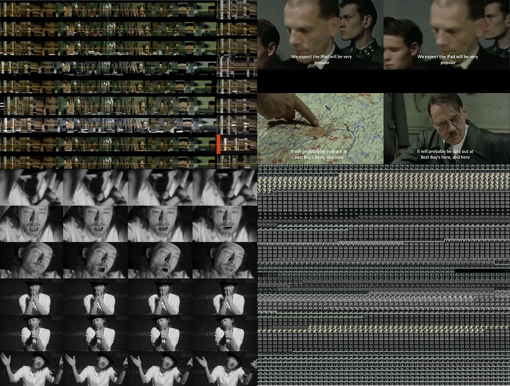
Modular Complexity and Remix: The Collapse of Time and Space into Search, by Eduardo Navas

Image: from top and left to right: sliced image analysis of Downfall meme, detail of Downfall meme, grid detail of Radiohead's Lotus Flower meme, and grid image montage of The Charleston Style meme.

Note: This text was written for the peer review Journal AnthroVision 1.1 | 2012 : First issue. It was published in September of 2012. It is released here with permission from the editors. A special thanks to Nadine Wanono and the peer reviewers for all their support in the process of revising and publishing the text.  This essay is the first formal release of my post-doc research for The Department of Information Science and Media Studies at The University of Bergen, Norway in collaboration with The Software Studies Lab at Calit2, University of California, San Diego during the period of 2010-2012. I will be releasing more of my research in the near future. For now, you may also look over related material, available in Remix Theory under Projects.


The complete article: Download PDF


To cite this article:

Référence électronique
Eduardo Navas, « Modular Complexity and Remix: The Collapse of Time and Space into Search  », Anthrovision [En ligne], 1.1 | 2012, mis en ligne le 01 septembre 2012, consulté le 15 mars 2013. URL : http://lodel.revues.org/10/anthrovision/324


Excerpt:

If postmodernity consisted of the collapse of time into space, then the time of globalization at the beginning of the twenty-first century consists of the collapse of time and space into search.  Culture has entered a stage in which time and space are redefined by modular access to knowledge in unprecedented fashion with the use of search engines. Search redefines the way people come to terms with historical developments that are constantly recycled and remixed with the use of new media technology.  A search is usually performed with engines such as Google and Bing; technology that is founded on research that brings together private and public interests.

This text is a reflection on the implications behind search algorithms that provide people with material that is relevant in correlation to a hierarchy of supposed importance that may reach great popularity, and perhaps even go viral (large circulation online) according to the use of key terms known as meta-data. This text is an evaluation of the aesthetics of search made possible because of what I call modular complexity; meaning, the ability to function within a system of modules that are autonomous but that also effectively inform and redefine each other.[1]  This, in effect, leads to the collapse of time and space into search; meaning, if the postmodern gave way to a sense of historical dismissal, such attitude is fully at play in networked culture as ahistoricity.  This shift, which informs emerging markets on the global network, repurposes interdisciplinary methodologies across fields of research in the social sciences as well as the humanities.

[1] I first introduce the concept of Modular Complexity in the Essay “Remix: The Ethics of Modular Complexity in Sustainability,” written for CSPA Journal’s Spring 2010 issue.  See: http://remixtheory.net/?p=461

The complete article: Download PDF

Relevant links in this blog are:

Research on Remix and Cultural Analytics, Part 1
Research on Remix and Cultural Analytics, Part 2
Research on Remix and Cultural Analytics, Part 3
Research on Remix and Cultural Analtytics, Part 4
Research on Remix and Cultural Analytics, Part 5 


Friday, February 15, 2013

Our guide for working with cultural data: organizing, cleaning, summarizing


I put together detailed notes for my how-to class working with cultural data

Organizing data, cleaning data, preparing data for analysis and visualization, creating data summaries

(wait for the link to load since its inside a long web page for my whole course)

The selection of topics and techniques is based on our work in the lab with hundreds of data sets since 2007, and the number of courses I taught on cultural data analysis and visualization for both undergraduates and graduate students.

These topics and techniques can be taught in a 2-3 class.

Intended audiences: all beginning digital humanities people (faculty and students) regardless of the field (art history, literary studies, commmunication, etc); people interested in visualizing data; data journalism.


Saturday, February 2, 2013

MA Thesis: Identifying Affordances in Adobe Photoshop


New software studies publication which analyzes the key artistic tool of out times - Photoshop:

Identifying affordances in Adobe Photoshop:
An investigation into the theory of affordances and its use insoftware analyses

MA Thesis by Herman van den Muijsenberg

New Media & Digital Culture, Utrecht University
Advisor: Dr. Ann-Sophie Lehmann

76 pages.