- Made in Sheffield: Industrial Perspectives on the Digital Humanities
Andrew Prescott - Live and Kicking: The Impact and Sustainability of Digital Collections in the Humanities
Lorna M. Hughes - A Framework for Supporting the Digital Humanities: An Alternative to the DH Centre
E. E. Snyder - Researchers as Infrastructure
Erik Malcolm Champion - Promise and Paradox: Accessing Open Data in Archaeology
Jeremy Huggett - An Undiscovered Country? A History of Archaeological Investigation in Post-War England
Tim N.L. Evans - Digital Historians in Italy and the United Kingdom: Perspectives and Approaches
Claudia Favero - Ahead of the CurV: Digital Curator Vocational Education
Ann Gow and Laura Molloy - From Individual Solutions to Generic Tools
Andrea Kulas and Lu Yu - The PATHS System for Exploring Digital Cultural Heritage
Mark Hall, Paula Goodale, Paul Clough and Mark Stevenson - Just Google It
Max Kemman, Martijn Kleppe and Stef Scagliola - The Problem of Citation in the Digital Humanities
Jonathan Blaney - Getting Rights Right! – The University of Sheffield Library Experience of Legal Issues and Digitisation.
Clare Scott - Mining Dutch History: Researching Public Debate in the Nineteenth Century
José de Kruif - Mapping Metaphors of Wealth and Want: A Digital Approach
Marc Alexander and Ellen Bramwell - The Compromises and Flexibility of TEI Customisation
James Cummings - Using Stand-off XML Markup to Record Scholarly Differences of Opinion About Typesetting
Gabriel Egan - False Memories and Dissonant Truths: Digital Newspaper Archives as a Catalyst for a New Approach to Music Reception Studies
Christopher Dingle and Laura Hamer - Analysing The Carlyle Letters Online
Dingding Wang, Guannan Zhao, Yajie Hu, Neil F. Johnson, Brent E. Kinser and Mitsunori Ogihara - More than Meets the Eye: Going 3D with an Early Medieval Manuscript
William Endres - Interpreting Textual Artefacts: Cognitive Insights into Expert Practices
Ségolène Tarte - Building Digital Editions on the Basis of a Virtual Research Environment
Tobias Schweizer and Lukas Rosenthaler - Exploring the Disciplinary Reach and Geographic Spread of the British Design Professions, 1959-2010
Leah Armstrong, Karina Rodriguez Echavarria, Dean Few and David Arnold - Analysing Big Cultural Data Patterns in 2200 Covers of Veja Magazine
Marcio Emilio dos Santos and Cicero Inacio da Silva - Data Journalism in Sweden - Opportunities and Challenges
Ester Appelgren and Gunnar Nygren - Improving Record Matching Across Disparate Historical Resources
David Croft, Stephen Brown and Simon Coupland - Crowdsourcing Our Cultural Heritage
Genovefa Kefalidou, Mercourios Georgiadis, Bryn Alexander Coles and Suchith Anand - Reperio: A Collaborative Knowledge Environment for Digital Humanities
Damiana Luzzi
Logo and Side Nav
News
Velit dreamcatcher cardigan anim, kitsch Godard occupy art party PBR. Ex cornhole mustache cliche. Anim proident accusamus tofu. Helvetica cillum labore quis magna, try-hard chia literally street art kale chips aliquip American Apparel.
Search
Browse News Archive
- March 2014
- February 2014
- January 2014
- December 2013
- November 2013
- October 2013
- September 2013
- August 2013
- July 2013
- June 2013
- May 2013
- April 2013
- March 2013
- February 2013
- January 2013
- December 2012
- November 2012
- October 2012
- September 2012
- August 2012
- July 2012
- June 2012
- May 2012
- April 2012
- March 2012
- February 2012
- January 2012
- December 2011
- November 2011
- October 2011
- September 2011
- August 2011
- July 2011
- June 2011
- May 2011
- April 2011
- March 2011
- February 2011
- December 2010
- November 2010
- October 2010
- August 2010
- July 2010
- June 2010
- May 2010
- April 2010
- March 2010
- February 2010
- January 2010
- December 2009
- November 2009
- October 2009
- September 2009
- August 2009
- July 2009
- June 2009
- May 2009
- April 2009
- March 2009
- February 2009
- January 2009
- December 2008
- November 2008
- October 2008
- September 2008
- August 2008
- July 2008
- June 2008
- May 2008
- April 2008
- March 2008
- February 2008
- January 2008
- December 2007
- November 2007
- October 2007
- September 2007
- June 2007
- May 2007
:
Tuesday, March 4, 2014
Proceedings of the Digital Humanities Congress (Sheffield) are online
Sunday, March 2, 2014
How to Visualize 4512 Instagram selfies? Introducing new nersion of our free ImageMontage tool
Montage of 4512 Instagram selfie photos from selfiecity.net project. Original image is 24000 pixels wide. (Montage shows our larger image set before we did the final manual check - so few images are not true single selfies. Images from Tokyo which were not used in the final presentation are also included.)

Closeup.

Full image (24000 pixels wide) scaled to 640 pixels.
See on Google+
See / download 8000 pixel wide version from Flickr.
Montage visualization of 33,292 photos shared on Instagram in Tel Aviv (April 20-26, 2012), sorted by hue (top to bottom, right to left). (These and three other visualizations below are from our Phototrails project - analysis and visualization of 2.3 million Instagram photos from 13 global cities.)
Montage visualization of 33,292 photos shared on Instagram in Tel Aviv during the same period, sorted by upload date (top to bottom, left to right).
Montage visualization of 55,498 Instagram photos from Tokyo uploaded during four consecutive days, sorted by upload date and time (top to bottom, left to right).
Montage visualization of 57,493 Instagram photos from New York uploaded during four consecutive days, sorted by upload date and time (top to bottom, left to right).
We released new version of ImageMontage free visualization tool (ImageMontage v.2).
ImageMontage v.2 - Key Features:
- Create high resolution montages of large image collections. For example, you can visualize a collection of 40,000 images (assume each image is 100 x 100 pixels) in a single 20,000 x 20,000 pixel montage.
- The images can have different sizes and/or proportions - they will be scaled to the same height in the montage.
- The order of images in a montage can be controlled by a user. (Create a text file with a list of file names in a sigle column, and use as the input in Image Source" option.) In the examples above, one montage organizes a set Instagram photos by upload date/time; another organizes the same images by average hue. (The plugins which measure image characteristics are included with our ImagePlot plugin.)
- You can include all images in a single folder; all images within subfolders; or images located in different areas of your drive ("Image Source" option.)
- The new version allows you to create 1-level, 2-level, or 3-level montages. For example, you can organize your photos by year, month, and event. Or, you can montage images of van Gogh painting by city, year, and season. (See examples below).
How to run:
ImageMontage is a plugin for ImageJ, a popular free open source image analysis software (runs on Mac, PC, Lunix).
1) Download ImageJ software;
2) Download ImageMontage plugin;
3) In ImageJ: use File > Open to open the plugin file. Then click on: Macros > Run. ImageMontage will start.
Also:
Check our ImagePlot and ImageSlice visualization plugins for ImageJ.
Examples of 1-level and 2-level montages:
A montage of selected van Gogh paintings organized by creation year (1-level montage).
A montage of selected van Gogh paintings organized by creation year and season (2-level montage).
Friday, February 28, 2014
Gender, age, and ambiguity of selfies on Instagram
selfiecity.net research update by Mehrdad Yazdani, Research Scientist, Software Studies Initiative.
Who are the people behind selfies? Are they mostly young? Do women prefer taking selfies over men? Do these variations depend on geographic location? We looked at over 4,500 selfies from six cities to gain a sense of the different age groups and genders. (Analysis and visualizations of our findings for 3200 images from five cities from this dataset are available on selfiecity.net.)
We did this by first downloading a random sample of 140,000 images among all Instagram photos shared by people in central areas of 6 global cities for one whole week (Dec 4-12, 2013). Our random sample of Instagram photographs include:
- 30,000 images from Tokyo
- 30,000 images from New York
- 20,000 images from Bangkok
- 20,000 images from Berlin
- 20,000 images from Moscow
- 20,000 images from Sao Paulo
What you see above is what we call the "selfie rate," that is, the percentage of selfies that our reviewers from Mechanical Turk found from the 140,000 images that we collected. What is most striking about this figure is that, in contrast to popular belief, the selfie is not ubiquitously plastered all over Instagram. In fact, Sao Paulo has a selfie rate clocking in at just under 5%! Tokyo, on the other hand, has an even significantly lower selfie rate of a hair above 1%.
But we don't stop at just finding selfies from our set of images. If a reviewer thinks that the image is indeed a selfie, he or she also takes a best guess at the gender and age of the selfie. Again, these are reviewers who use Mechanical Turk on a regular basis and therefore asking them to complete an image-tagging problem is on-par with their expertise. The graph above shows that the gender distribution of the selfies is heavily skewed towards females. Moscow in particular has a large disproportionate amount of female selfies. In fact, it is 4 times less likely that a selfie from Moscow is male (with a 95% confidence interval between 3.3 and 5.3).
However, it is not fair to assume that gender is a binary factor that we can neatly divide into "male" or "female." Would it be possible for us to have a way of measuring the ambiguity of a selfie's gender? Answering such a question is extremely difficult, but let's take a data science approach (read: hack). We will make an assumption that if it is difficult to ascertain a selfie's gender as "male" or "female" then our reviewers from Mechanical Turk will have a harder time making a decision. Since we have multiple reviewers (at least 3 or more), then there will be more disagreements if it is truly difficult for the reviewers to determine the selfie's gender. Let's assign a confidence score between 0 and 1 to the collective agreement of the reviewers for the gender of the selfie. What follows are the averages of gender discrimination confidence for the different cities:
We see some very interesting patterns emerging from this figure. Over the entire population, we see that the reviewers are fairly confident (over 95%) of a selfie's gender. However, consistently for every city, the average gender confidence for males is less than those of females. In the case of Berlin, this difference may very well be insignificant and due to chance, but for the other cities we see much wider gap in confidence. Especially in the case of Sao Paulo and Moscow, the reviewers are much more confident at detecting females than the other cities. One possible interpretation: What makes these cities unique is that women in these cities are unquestionably "female looking" (at least when they take their selfies and post them), so the confidence reviewers have for these female selfies is higher.
We next take a look at the age distributions of the selfies. Here they are organized by city and gender:
The most dramatic result here is that for every city we see that men who take selfies are older than their female counterparts. Bangkok has the youngest selfie enthusiasts, while New Yorkers have the oldest. If we look on a log-scale, as the age of a selfie increases, the odds of the selfie being male increases by a factor of 6.7 (with a 95% confidence interval between 4.99 and 9.03). Overall, however, the early twenty somethings dominate selfies on Instagram. As before, we determine the age of the selfie by asking several reviewers to make their best guess. We then estimate the age of the selfie by taking the median of the guesses of the reviewers. As in the case for determining gender, this can be a very difficult task and certain selfies can be harder to answer. To ascertain the agreement level for a selfies age, we computed the standard deviation of the reviewers guesses. In this case, higher standard deviation suggests more disagreement among the reviewers. We refer to this standard deviation as the "disagreement." Below we show average disagreements for each city and gender:
With the exception of Berlin and New York (that have the highest disagreements), female age discrimination has the least amount of disagreement. The difference between the disagreement levels of males and females in Berlin does not appear to be significant. By far, Bangkok has the least amount of disagreement for age discrimination of female selfies among all cities. It is difficult to ascertain why this is the case. We welcome any hypotheses for this finding!
In summary, our study suggests that selfies are not the dominant imagery shared on Instagram. We have also observed that the selfies are extremely popular by females and twenty somethings. We are planning more posts on softwarestudies.com about additional details and more results from selfiecity.net research, so check back to see them.
Tuesday, February 25, 2014
Video about our selfiecity.net project is now on YouTube and Vimeo
selfiecity from Moritz Stefaner on Vimeo.
http://selfiecity.net
Investigating the style of self-portraits (selfies) in five cities across the world.
Selfiecity investigates selfies using a mix of theoretic, artistic and quantitative methods:
We present our findings about the demographics of people taking selfies, their poses and expressions.
Rich media visualizations (imageplots) assemble thousands of photos to reveal interesting patterns.
The interactive selfiexploratory allows you to navigate the whole set of 3200 photos.
Finally, theoretical essays discuss selfies in the history of photography, the functions of images in social media, and methods and dataset.
Learn more at http://selfiecity.net
Thursday, February 20, 2014
Our new project Selfiecity Investigates the style of self-portraits (selfies) in five cities across the world.

Our new project is now online:
The project investigates selfies using a mix of theoretic, artistic and quantitative methods:
We present our findings about the demographics of people taking selfies, their poses and expressions.
Rich media visualizations (imageplots) assemble thousands of photos to reveal interesting patterns.
The interactive selfiexploratory allows you to navigate the whole set of 3200 photos.
Theoretical essays discuss selfies in the history of photography, the functions of images in social media, and our methods and dataset.
Tuesday, February 11, 2014
An Outline for Computational Art History
The Hawaiian Star, 5930 front pages, 1893-1912 (Vimeo). Created by UCSD undergraduate student Cyrus Kiani in Manovich's visualization class, 2012.
An Outline for Computational Art History
Computational art history - use of algorithms for the analysis and visualization of patterns in art production, dissemination, reception/interaction, and scholarship. (In other words: use of computers to augment human intellect and intuition.)
Three complementary ways to think about research projects and methods in computational art history:
1 | Which stage(s) in art circulation process do you want to analyze?
- production [example 1, example 2]
- dissemination [example]
- reception (visitors movements in a museum, user tags, professional art criticism publication, user searches, etc.) [example]
- user interaction with digital media [many possibilities for capturing data about the experience; the work is co-created by software and participant]
- institutions / exhibitions / collecting / publications / art sales / art world system [example 1, example 2]
- scholarship
and also:
influence [example]
artists networks [example]
interactions with other cultural areas
etc.
2 | What data types you want to analyze?
structured, unstructured
text, images, video, 3D shapes, spaces, networks of relations, geospatial data, movements capture, interactions capture
3 | Which stage(s) in data analysis workflow you will work on?
- acquire and clean data (media agnostic)
- organize data for analysis (media agnostic)
- feature extraction (automatic) (media specific) / adding metadata (media agnostic)
- exploratory visualization (media agnostic)
[however images and video allow for unique visualization techniques: example 1, example 2]
- (optional) data analysis using classical statistics and/or data science methods (media agnostic)
Lev Manovich, february 11, 2014.
Sunday, January 26, 2014
"Software, Globalization and Political Action" course co-taught by Manovich and Buck-Morss, Spring 2014, Graduate Center CUNY
#softclassgc (class Twitter hashtag)
SYLLABUS (Google Doc updated throughout the semester - we suggest you check it every weekend to see the updates)
Readings (Dropbox)
Top: a frame from A Man with a Movie Camera by Dziga Vertov, 1929.
Bottom: Visualization of locations of large number of photos in NYC shared on Flickr, from "Locals and Tourists" by Erik Fisher, 2009).
Spring 2013 course: Software, Globalization, and Political Action
Co-taught by Susan Buck-Morss (Political Science) and Lev Manovich (Computer Science). The Graduate Center, City University of New York (CUNY)
Tuesdays 2-4pm.
4 Credits. Cross-listed in the Programs in Political Science, Computer Science and Art History.
Description:
This interdisciplinary seminar will explore concepts and methods from both critical theory and software studies. It is taught by Prof. Susan Buck-Morss (Political Science), and Prof. Lev Manovich (Computer Science).
We will cover three themes:
1) Vision and Image - From Walter Benjamin and Dziga Vertov to computer vision, Google Earth, Adobe Creative Suite, and Instagram: new strategies of seeing and representation in modern and software societies. Image v. Concept (Hegel against ‘picture thinking’) Image and historical matter (Benjamin on the “dialectical image”). Aesthetics and Politics: Images as a (trans-local) language for political action; vision and democracy: the “ethical turn.” Digital Image Processing and Computer Vision and examples of their application in creative industries, vernacular digital photography, and digital humanities.
2) Data and Knowledge - Knowledge production in the age of "big data." Images as sources of knowledge. Political critique of methods (positivism, abstraction, categorical givens) and goals (surveillance, marketing, positivism). Knowledge of, by and for whom? Data science as the new key technology for production of knowledge and decision making in big data societies. Data visualization as a research method in humanities and social sciences (including art history and political science). From representing reality to representing data. Data art.
3) Crowds and Networks - What are the new forms of sociality and political action enabled by global networks? Networked Images as political instruments. Crowds and the de-centered brain. Crowds and/as a medium of global political action since the Arab Spring. The new body politic as a body without skin. Social networks and computational social science. Social media analytics. Artistic visualizations of social data.
Tuesday, January 14, 2014
O software é a mensagem

Lev Manovich, 2013
Tradução: Cicero Inacio da Silva
Como resultado, o software surgiu como a principal nova forma de mídia fora do tempo (digo "software" em vez de "computadores digitais", porque estes últimos são utilizados para fazer tudo em nossa sociedade, e muitas vezes suas utilizações não envolvem softwares visíveis para os usuários comuns - como os sistemas dentro de um carro). Para além de certas áreas culturais, como o artesanato e as obras de arte, o software substituiu um diversificado leque de tecnologias físicas, mecânicas e eletrônicas utilizadas antes do século XXI para criar, armazenar, distribuir, acessar artefatos culturais e de comunicação entre pessoas. Quando você escreve um artigo no Word, você está usando software. Ao escrever um post de blog no Blogger ou WordPress, você está usando software. Quando você tuíta, posta mensagens no Facebook, pesquisa nos milhões de vídeos no YouTube ou lê textos no Scribd, você utiliza softwares (especificamente sua categoria conhecida como "aplicações web" ou "webware" - softwares que são acessados via web por meio de navegadores e que ficam hospedados em servidores).
As teorias de McLuhan cobriram as principais "novas mídias" de sua época - televisão, jornais e revistas com fotos coloridas, publicidade e cinema. Assim como esses meios, a mídia software levou décadas para se desenvolver e amadurecer até chegar ao ponto onde ele hoje domina a nossa paisagem cultural. De que maneira o uso de aplicativos de criação de mídia profissionais influenciam a imaginação visual contemporânea? De que forma os softwares oferecidos por serviços de mídia social, como o Instagram, modelam as imagens que as pessoas capturam e compartilham? De que maneira os algoritmos específicos do Facebook, aqueles que decidem quais atualizações realizadas por nossos amigos serão mostradas em nosso feed de notícias, moldam a maneira como compreendemos o mundo? De modo mais geral , o que significa viver em uma "sociedade do software"? Em 2002 eu estava em Colônia, na Alemanha, e fui para a melhor livraria da cidade dedicada a livros de ciências humanas e artes. Sua seção de "novas mídias" continha centenas de títulos. No entanto, nem um único livro era dedicado ao motor essencial da "era do computador": o software. Eu comecei a folhear os índices, livro após livro: nenhum deles continha a palavra "software". Como isso era possível? Hoje, graças aos esforços dos meus colegas nesse novo campo acadêmico dos "estudos de software", a situação está gradualmente melhorando. No entanto, quando olhei para os índices de obras de importantes teóricos da mídia do nosso tempo publicados no ano passado, ainda não encontrei a entrada para o termo "software".
Por que essa conceituação é útil? O "Software Cultural" não é simplesmente um novo objeto, não importa quão grande e importante, que foi abandonado no espaço do que chamamos "cultura". E enquanto nós certamente podemos estudar "a cultura do software" - as práticas de programação, os valores e ideologias de programadores e empresas de software, as culturas do Vale do Silício e de Bangalore etc. - se apenas fizermos isso, não vamos compreender a real importância do software. Assim como o alfabeto, a matemática, a indústria gráfica, o motor a combustão, a eletricidade e os circuitos integrados, o software se reorganiza e remodela todas as coisas às quais ele é aplicado, ou pelo menos, têm potencial para fazer isso. Assim como a inserção de uma nova dimensão adiciona novas coordenadas para cada ponto no espaço, “acrescentando" o software à cultura, alteramos a identidade das coisas de que cultura é feita. Nesse sentido, o software é um exemplo perfeito do que McLuhan quis dizer quando escreveu que "a mensagem de qualquer meio ou tecnologia é a mudança de escala, de ritmo ou de padrão que ela introduz nos assuntos humanos".
No entanto, o desenvolvimento e a hegemonia atual do software não se limita a ilustrar perfeitamente os pontos que McLuhan analisou há 50 anos. Ela também desafia estas idéias. Aqui está como.
Nas primeiras décadas, a escrita de novos softwares era um campo para profissionais. No entanto, já na década de 1960, Ted Nelson e Alan Kay propuseram que os computadores poderiam tornar-se um novo tipo de meio cultural. Em seu paradigma, os designers criariam ferramentas de programação e os usuários poderiam inventar novos meios de utilizar essas ferramentas. Nesse sentido, Alan Kay chamou os computadores de a primeira metamídia, cujo conteúdo é "uma ampla variedade de mídias já existentes e que ainda não foram inventadas".
Esse paradigma teve profundas consequências em como o “meio” software funciona hoje em dia. Uma vez que os computadores e a programação foram suficientemente democratizadas, algumas das pessoas mais criativas do nosso tempo começaram a se concentrar na criação de novas estruturas e técnicas ao invés de usar as já existentes para produzir "conteúdos". Durante os anos 2000, estendendo o domínio da metamídia à escrita de novos códigos (softwares), plugins, bibliotecas de programação, entre outras ferramentas, esse fato acabou tornando-se uma nova forma de atividade cultural de ponta.
O GitHub, por exemplo, uma plataforma popular para o compartilhamento e desenvolvimento de ferramentas de código aberto, abriga centenas de milhares de projetos de software. Atualmente criar novas ferramentas de software é atividade fundamental para as áreas de humanidades digitais e software art . E, certamente, as principais "empresas de mídia" do nosso tempo, tais como Google, Facebook, Instagram etc. não criam conteúdo. Em vez disso, constantemente aperfeiçoam e expandem suas ferramentas de software utilizadas por centenas de milhões de pessoas para produzir conteúdo e se comunicar.
Nesse sentido, é hora de atualizar Understanding Media. Hoje em dia já não é o meio que é a mensagem. É o software que é a mensagem. E a expansão constante do que os humanos podem expressar, e como eles podem se comunicar, a partir de agora é o nosso “conteúdo”.
Wednesday, January 1, 2014
Looking back: 2013 publications and projects from Software Studies Initiative
Projects:
Phototrails: Analysis and visualization of 2.3 million Instagram photos shared by people in 13 global cities. Released 7/1/2013. Team: Nadav Hochman, Lev Manovich, Jay Chow.
Exhibitions:
The Aggregate Eye: 13 cities / 312,694 people / 2,353,017 photos. Amelie A. Wallace Gallery, October 29 – December 5, 2013. Artists: Nadav Hochman, Lev Manovich, Jay Chow. Curators: Hyewon Yi and Alise Tifentale.
Books:
Manovich, Lev. Software Takes Command. Bloomsbury Academic, published 7/4/2013. 100,000 words.
Articles and book chapters (13):
Akdag Salah, A.A., L. Manovich, A.A. Salah and J. Chow, "Combining Cultural Analytics and Networks Analysis: Studying a Social Network Site with User-Generated Content." Journal of Broadcasting and Electronic Media, Volume 57, Issue 3, pp. 409-426, 2013.
Hochman, Nadav and Lev Manovich. Visualizing Spatio-Temporal Social Patterns in Instagram Photos. In proceedings of the GeoHCI Workshop in conjunction with ACM CHI 2013. Paris, France, April 2013.
Hochman, Nadav and Manovich, Lev. Zooming into an Instagram City: Reading the local through social media. First Monday, 6/1/2013.
Adelheid Heftberger. "Das Potential der reduktionslosen Visualisierung am Beispiel von DAS ELFTE JAHR und DER MANN MIT DER KAMERA von Dziga Vertov." Chronos-Verlag, Geschichte und Informatik (forthcoming 2014).
Navas, Eduardo. Modular Complexity and Remix: The Collapse of Time and Space into Search. Published in AnthroVision 1.1 (2012); released on softwarestudies.com on 4/19/2013.
Manovich, Lev. Museum Without Walls, Art History without Names: Visualization Methods for Humanities and Media Studies. Oxford Handbook of Sound and Image in Digital Media, edited by Carol Vernallis, Amy Herzog, and John Richardson (Oxford University Press, 2013).
Manovich, Lev. Media Visualization: Visual Techniques for Exploring Large Media Collections. The International Encyclopedia of Media Studies, Volume VI: Media Studies Futures, ed. Kelly Gates, (Blackwell, 2013).
Manovich, Lev. Visualing Vertov. First part published in Russian Journal of Communication (Taylor & Francis); second part to appear in Cinematicity, eds. Jeff Geiger and Karin Littau (Edinburgh University Press). 1/11/2013.
Manovich, Lev. The Language of Media Software. 2/18/2013. Forthcoming in The App Book, eds. Svitlana Matviyenko and Paul Miller (The MIT Press, forthcoming 2014).
Manovich, Lev. Media After Software. Journal of Visual Culture. 4/5/2013.
Manovich, Lev. Visualizing Social Photography. 11/2013. Forthcoming in Aperture #214, winter 2014.
Manovich, Lev. Software is The Message. 12/2013. Forthcoming in Journal of Visual Culture, spring 2014.
Manovich, Lev. The Algorithms of Our Lives. The Chronicle of Higher Education, 12/16/2013.
Tuesday, December 17, 2013
Visualizando fotografias sociais
Lev Manovich, 2013.
Tradução: Cicero Inacio da Silva.
No prelo a ser publicado na revista Aperture #214 (2014).
Neste verão o Museu de Arte Moderna de Nova Iorque (MoMA) pediu ao grupo de Estudos do Software, um programa que iniciei em 2007, para analisar como a visualização poderia ser usada como uma ferramenta de pesquisa e, talvez, como um meio para mostrar sua coleção de fotografias de maneira inovadora. Tivemos acesso a aproximadamente vinte mil fotografias digitalizadas, que combinamos em uma só imagem de super alta definição usando nosso software. Isso nos permitiu visualizar todas as imagens de uma só vez, rolando das imagens do início da mídia fotográfica até imagens registradas recentemente, abrangendo países, gêneros, técnicas e diversos aspectos da sensibilidade dos fotógrafos. Praticamente cada ícone fotográfico foi incluído - imagens que eu tinha visto repetidamente reproduzidas. Minha habilidade em facilmente poder realizar um zoom em cada imagem e estudar seus detalhes, ou diminuir o zoom para ver a imagem em sua totalidade, foi quase uma experiência religiosa.
Observar vinte mil fotografias simultaneamente pode soar surpreendente, uma vez que até mesmo a maior galeria do museu possui, no máximo, uma centena de obras. E isso que a coleção do MoMA, usando os padrões do século XX, pode ser considerada escassa em comparação com os enormes repositórios de fotografias existentes em sites de compartilhamento de mídia, tais como Instagram, Flickr e 500px. (o Instagram sozinho já contém mais de um bilhão de fotografias, enquanto que os usuários do Facebook sobem mais de dez bilhões de imagens todos os meses). A ascenção da "fotografia social", lançada pelo Flickr em 2005, inaugurou novas possibilidades fascinantes para o campo da pesquisa cultural. A foto-universo criada por centenas de milhares de pessoas pode ser considerada como um mega-documentário, sem roteiro nem diretor, mas a escala desse documentário requer ferramentas computacionais - bases de dados, motores de busca e visualização, para que possamos assistí-lo.
Explorar (minerar) as partes constituintes desse "documentário" pode nos ensinar sobre a fotografia vernacular e hábitos que regem o desenvolvimento da imagem digital. Quando as pessoas se fotografam, será que elas privilegiam estilos de enquadramentos específicos, como os fotógrafos profissionais? Será que os turistas que visitam Nova Iorque fotografam os mesmos objetos; será que suas escolhas são culturalmente determinadas? E quando eles fotografam os mesmos objetos (por exemplo, plantas no High Line Park em Manhattan), eles usam as mesmas técnicas?
Crandall e sua equipe, usando o conjunto de fotos coletadas, também determinaram os locais mais fotografados em vinte e cinco áreas metropolitanas. Isso os levou a novas descobertas - o quinto local mais fotografado de Nova York foi a loja da Apple no centro; A Tate Modern foi classificada como número dois em Londres.
O projeto de foto-mapeamento Locals and Tourists, criado em 2010 pelo artista de dados e desenvolvedor de software Eric Fisher, focou em uma pergunta, provavelmente motivada por tais informações: quantas dessas imagens foram capturadas por turistas ou moradores locais, e como que essa diferenciação pode revelar diferentes padrões? O projeto "Moradores e Turistas" de Fisher apontou os locais com um grande número de fotografias no Flickr e usou cores para indicar quem as tirou: as imagens azuis foram tiradas por habitantes locais e as imagens vermelhas foram registradas por turistas. As fotos com cores amarelas podem ter sido registradas por outros grupos. No total ele mapeou 136 cidades e depois compartilhou esses mapas no Flickr. Em seu mapa de Londres vemos como os turistas freqüentam alguns locais bem conhecidos, todos eles no centro de Londres, enquanto que os moradores locais cobrem toda a cidade, mas documentam imagens menos assiduamente.
Esses projetos pioneiros usam metadados para revelar padrões em fotografia social. Contudo, eles não usaram imagens reais em suas visualizações, uma prática explorada pela primeira vez, ao menos que eu saiba, pelo artista James Salavon. Para projetos como Every Playboy Centerfold, 1988–1997 e Homes for Sale, 1999-2002, Salavon fez uma composição de um número de imagens para revelar as convenções fotográficas utilizadas para representar assuntos específicos. Seu trabalho mais recente, Good and Evil '12, 2012, é composto por dois painéis, cada um mostrando cerca de vinte e cinco mil fotografias resultantes das buscas realizadas no Bing das cem palavras mais positivas ou negativas em Inglês.
Os mídia artistas como Salavon demonstram como a visualização pode revelar padrões no conteúdo de coleções de imagens de grandes dimensões. Em 2007 montei um laboratório de pesquisa para explorar ainda mais essas ideias e desenvolver ferramentas de visualização de código aberto que podem ser usadas por quem trabalha com historiadores da arte, imagens, estudiosos de cinema, mídia e curadores. Uma das nossas ferramentas de software pode analisar as propriedades visuais (como contraste, tons de cinza , textura, cores dominantes , orientações de linha) e algumas dimensões do conteúdo (presença e posição dos rostos e corpos) em qualquer número de imagens. Outra ferramenta pode utilizar os resultados desta análise para posicionar todas as imagens em uma única visualização de alta resolução ordenada por suas propriedades e metadados. Nós usamos essas ferramentas para visualizar uma variedade de coleções de imagens, que vão de cada uma das capas da revista Time entre 1923 e 2009, num total de 4.535 capas, até um milhão de páginas de mangá.
Em nosso projeto recente, Phototrails, o doutorando em História da Arte Nadav Hochman, o designer/ programador Jay Chow e eu começamos a explorar padrões em fotos enviadas para sites de mídia social. Na primeira fase do projeto, baixamos e analisamos 2,3 milhões de fotos do Instagram advindas de treze cidades globais. Uma das nossas visualizações mostra 53.498 fotos compartilhadas por pessoas em Tóquio durante alguns dias consecutivos. A progressão das atividades dominantes das pessoas ao longo de um dia de trabalho, jantando, saindo - reflete-se na mudança de cores e brilho das imagens. Nenhum dia é igual. Alguns são mais curtos do que os outros, ou a progressão entre as diferentes actividades é muito gradual, enquanto que em outros é mais nítida. Juntas, essas fotos criam um "documentário agregado" de Tokio - um retrato da mudança dos padrões temporais da cidade que foram reunidos a partir de milhares de atividades documentadas .
Mas os documentários a partir de um conjunto de imagens são algo novo? O documentário experimental Um Homem com uma câmera (1929) de Dziga Vertov, que retrata um dia na vida de uma cidade soviética, pode ser considerado um precursor dessa forma. O filme combina filmagens realizadas em três cidades ucranianas - Odessa, Khartiv e Kiev - ao longo de um período de três anos. Vertov queria comunicar ideias particulares, como a construção de uma sociedade comunista que orientou a seleção e edição de sua filmagem.
Nossas visualizações de hábitos humanos renderizados por meio de fotografias advindas do Instagram não refletem somente um único ponto de vista. Mesmo assim, elas são tão subjetivas quanto as mais tradicionais fotografias. Assim como um fotógrafo decide sobre o enquadramento e a perspectiva, nós tomamos decisões formais sobre como mapear as imagens, organizá-las por datas de upload, ou cor, ou brilho e assim por diante. Mas, visualizando o mesmo conjunto de imagens de várias maneiras (veja aqui um exemplo que usa uma coleção de obras de arte de Mark Rothko), lembramos que nenhuma visualização oferece uma interpretação objetiva, assim como nenhuma imagem documental única e tradicional jamais poderia ser considerada neutra, ao invés disso, a diversidade das fotografias do Instagram destacam a variedade de padrões complexos de vida que se desdobram em cidades que nunca podem ser de forma total visualmente capturadas em uma única visualização, apesar da nossa capacidade de usar milhões de fotos do Instagram.
( Novembro, 2013)
"Software is the Message" - new mini article (1000 words) from Lev Manovich

Software is the Message
Lev Manovich. 2013.
Forthcoming in Journal of Visual Culture, special issue "Marshall McLuhan's Understanding Media: The Extensions of Man @ 50" (Spring 2014).
(Note: Some parts of this text come from my book Software Takes Command, Bloomsbury Academic, 2013.)
Did Marshall McLuhan “miss” computers? In his major work, Understanding Media: The Extensions of Man (1964) the word “computer” appears 21 times in the book, and a few of those references are to “computer age.” However, despite these references, his awareness of computers did not have significant effect on his thinking. The book contains two dozens chapters each devoted to a particular medium—which for McLuhan range from writing and roads to cars and television. (The last chapter “Automation” addresses the role of computers for industrial control, but not its other roles).
The reasons for this omission are not hard to understand. McLuhan’s theories were focused on the media that were widely employed by regular people in human history. In 1964, the popular media for representation and communication did not yet include computers. Although by the end of the 1960s computer systems for design, drawing, animation, word processing were also developed (along with the first compute network that eventually became the Internet), these systems were only used by small communities of scientists and professionals. Only after the introduction of a PC in 1981, these inventions started to be disseminated to the masses.
As a result, software has emerged as the main new media form of out time. (I say “software” rather than “digital computers” because the latter are used to do everything in our society, and often their use does not involve software visible to the ordinary users – like the systems inside a car.) Outside of certain cultural areas such as crafts and fine art, software has replaced a diverse array of physical, mechanical, and electronic technologies used before the twenty-first century to create, store, distribute and access cultural artifacts, and communicate with other people. When you write an article in Word, you are using software. When you are composing a blog post in Blogger or WordPress, you are using software. When you tweet, post messages on Facebook, search through billions of videos on YouTube, or read texts on Scribd, you are using software (specifically, its category referred to as “web applications” or “webware”—software which is accessed via web browsers and which resides on the servers).
McLuhan’s theories covered the key “new media” of his time – television, newspapers and magazines with color photos, advertising, and cinema. Just as these mediums, software medium took decades to develop and mature to the point where it dominates our cultural landscape. How does the use of professional media authoring applications influences contemporary visual imagination? How does the software offered by social media services such as Instagram shapes the images people capture and share? How do particular algorithms used by Facebook to decide what updates from our friends to show in our News Feed shape how we understand the world? More generally, what does it mean to live in “software society”?
In 2002, I was in Cologne, Germany, and I went into the best bookstore in the city devoted to humanities and arts titles. Its new media section contained hundreds of titles. However, not a single book was devoted to the key driver of the “computer age”: software. I started going through indexes of book after book: None of them had the word “software” either. How was that possible? Today, thanks to efforts of my colleagues in the new academic field of “software studies,” the situation is gradually improving. However, when I looked at indexes of works of key media theorists of our time published in the last year, I still did not find entry for “software.” Software as a theoretical category is still invisible to most academics, artists, and cultural professionals interested in IT and its cultural and social effects.
Software is the interface to our imagination and the world—a universal language through which the world speaks, and a universal engine on which the world runs. Another term that we can use in thinking about software is that of a dimension (think of three dimensions that we use to define space). We can say that at the end of the twentieth century humans have added a fundamentally new dimension to everything that counts as “culture — that of software.
Why this conceptualization is useful? “Cultural software” is not simply a new object—no matter how large and important—which has been dropped into the space which we call “culture.” And while we can certainly study “the culture of software”—programming practices, values and ideologies of programmers and software companies, the cultures of Silicon Valley and Bangalore, etc.—if we only do this, we will miss the real importance of software. Like the alphabet, mathematics, printing press, combustion engine, electricity, and integrated circuits, software re-adjusts and re-shapes everything it is applied to—or at least, it has a potential to do this. Just as adding a new dimension adds a new coordinate to every point in space, “adding” software to culture changes the identity of everything that a culture is made from. In this respect, software is a perfect example of what McLuhan meant when he wrote that the “message of any medium or technology is the change of scale or pace or pattern that it introduces into human affairs.”
However, the development and current hegemony of software does not simply perfectly illustrate the points McLuhan made 50 years ago. It also challenges these ideas. Here is how.
In the first few decades, writing new software was the domain of professionals. However, already in the 1960s Ted Nelson and Alan Kay proposed that computers could become a new kind of cultural medium. In their paradigm, the designers would create programming tools, and the users would invent new media using these tools. According, Alan Kay called computers the first metamedium whose content is “a wide range of already-existing and not-yet-invented media.”
This paradigm had far-reaching consequences for how software medium functions today. Once computers and programming were democratized enough, some of the most creative people of our time started to focus on creating these new structures and techniques rather than using the existing ones to make “content.” During the 2000, extending the computer metamedium by writing new software, plugins, programming libraries and other tools became the new cutting-edge type of cultural activity.
For example, GitHub, a popular platform for sharing and developing open source tools, houses hundreds of thousands of software projects. Making new software tools is central for the fields of digital humanities and software art. And certainly, the key “media companies” of our time such as Google, Facebook, or Instagram do not create content. Instead they constantly refine and expand their software tools used by hundreds of millions of people to make content and to communicate.
Thus, its time to update Understanding Media. It is no longer the medium that is the message today. Instead, the software is the message. And continuously expanding what humans can express and how they can communicate is now our “content.”
Monday, December 16, 2013
"Visualizing Social Photography" - new mini-article (1000 words) from Lev Manovich
Visualizing Social Photography
Lev Manovich. 2013.
Forthcoming in Aperture magazine #214 (2014).
This summer the Museum of Modern Art in New York asked the Software Studies Initiative, a program I started in 2007 to explore how visualization could be used as a research tool and perhaps a means to present their photography collection in a novel way. We received access to approximately twenty thousand digitized photographs, which we then combined using our software in a single very high resolution image. This allowed us to view all the images at once, scrolling from those dating from the dawn of the medium to the present, spanning in the meantime countries, genres, techniques, and photographers’ diverse sensibilities. Practically every iconic photograph was included—images I had seen reproduced repeatedly. My ability to easily zoom in on each image and study its details, or zoom out to see it in its totality, was almost a religious experience.
Looking at twenty thousand photographs simultaneously may sound amazing, since even the largest museum gallery includes about a hundred works at the most. And yet, MoMA’s collection, by twentieth-century standards, is meager compared with the massive reservoirs of photographs available on media sharing sites such as Instagram, Flickr, and 500px. (Instagram alone already contains over one billion photographs, while Facebook users upload over ten billion images every month.) The rise of “social photography,” pioneered by Flickr in 2005, has opened fascinating new possibilities for cultural research. The photo-universe created by hundreds of millions of people might be considered a mega-documentary, without a script or director, but this documentary’s scale requires computational tools—databases, search engines, visualization—in order to “watch.”
Mining the constituent parts of this “documentary” can teach us about vernacular photography and habits that govern digital image making. When people photograph one another, do they privilege particular framing styles, ala a professional photographer? Do tourists visiting New York photograph the same subjects; are their choices culturally determined? And when they do photograph the same subject (for example, plants on the High Line Park in West Manhattan), do they use the same techniques?
To begin answering these questions, we can use computers to analyze the visual attributes and content of millions of photographs and their accompanying descriptions, tags, geographical coordinates, upload dates and times, and then interpret the results. While this research only began a few years ago, there are already a number of interesting projects that point toward future “computational visual sociology” and “computational photo criticism.”
In 2009, David Crandall and his colleagues from the Computer Science Department at Cornell University published a paper titled Mapping the World’s Photos based on analysis of approximately thirty-five million Flickr photographs. As part of their research, they created a map consisting of locations where all these images were taken ("world heat map"). Areas with more photos appear brighter, while those with fewer photographs are dark. Not surprisingly, the United States and Western Europe are brightly illuminated, while the rest of the world remains in the dark, indicating more sporadic coverage. But the map also reveals some unexpected patterns—the shorelines of most continents are very bright, while the interiors of the continents, with the notable exceptions of the States and Western Europe, remain completely dark.
Using their collected photo set, Crandall and his team also determined the most photographed locations in twenty-five metropolitan areas. This led to novel discoveries—New York’s fifth most photographed location was the midtown Apple store; Tate Modern ranked number two in London.
A photo-mapping project Locals and Tourists created in 2010 by data artist and software developer Eric Fisher addressed a question likely prompted by such information: how many of these images were captured by tourists or local residents, and how does this distinction can reveal different patterns? Fisher’s “Locals and Tourists” plotted the locations of large numbers of Flickr photographs by using color to indicate who took them: blue pictures by locals, red pictures by tourists, yellow pictures might have been made by either group. In total he mapped 136 cities, then shared these maps on Flickr. In his map of London we see how tourists frequent a few well-known sites, all in central London, while locals cover the whole city, but document less assiduously.
These pioneering projects use metadata to reveal telling patterns in social photography. However, they did not use actual images in their visualizations, a practice first explored, to my knowledge, by artist James Salavon. For projects such as Every Playboy Centerfold, 1988–1997 and Homes for Sale, 1999-2002, Salavon composited a number of images to reveal the photographic conventions used to represent particular subjects. His more recent work, Good and Evil '12, 2012, consists of two panels, each showing approximately twenty-five thousand photographs returned by Bing image search for the one-hundred most positive or negative words in English.
Media artists like Salavon demonstrate how visualization may uncover patterns in the content of large image collections. In 2007, I set up a research lab to explore this idea further and to develop open-source visualization tools that can be used by anyone working with images—art historians, film and media scholars, curators. One of our software tools can analyze visual properties (such as contrast, gray scale, texture, dominant colors, line orientations) and some dimensions of content (presence and positions of faces and bodies) of any number of images. Another tool can use results of this analysis to position all images in a single high-resolution visualization sorted by their properties and metadata. We used these tools to visualize a variety of image collections, ranging from every cover of Time magazine between 1923 and 2009, a total of 4,535 covers, to one million manga pages.
In our recent project, 
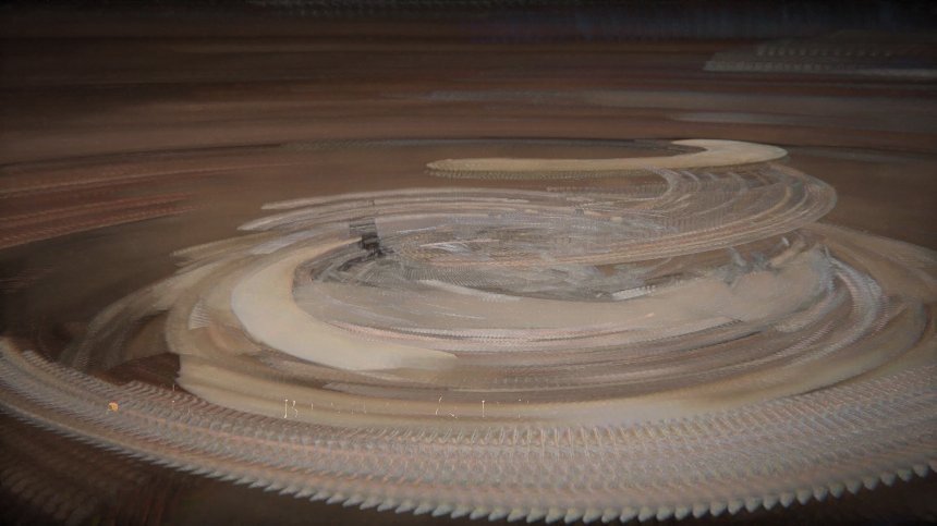
Phototrails, Art History PhD student Nadav Hochman, designer/programmer Jay Chow and myself started to explore patterns among photos uploaded to social media sites. In the first stage of the project, we downloaded and analyzed 2.3 million Instagram photographs from thirteen global cities. One of our visualizations shows 53,498 photos shared by people in Tokyo over a few consecutive days. The progression of people’s dominant activities throughout the day—working, having dinner, going out—is reflected in changing colors and relative brightness of images. No day is the same. Some are shorter than others, or the progression between different activities is very gradual, while in others it is sharper. Together, these photos create an “aggregate documentary” of Tokyo—a portrait of the city’s changing temporal patterns aggregated from thousands of documented activities.
But are aggregated documentaries new? Dziga Vertov’s 1929 experimental documentary film Man with a Movie Camera, which portrays a single day in the life of a Soviet city, might be considered a precursor to the form. The film combines footage shot in three separate Ukrainian cities—Odessa, Khartiv, and Kiev—over a three-year period. Vertov wanted to communicate particular ideas such as construction of a communist society that guided the selection and editing of his footage.
Our visualizations of human habits rendered through Instagram photographs do not reflect a single directorial point of a view. Even so, they are as subjective as more traditional photography. Just as a photographer decides on framing and perspective, we make formal decisions about how to map the images, organizing them by upload dates, or average color, or brightness, and so on. But by visualizing the same set of images in multiple ways (here is an example which uses a collection of artworks by Mark Rothko, we remind viewers than no single visualization offers an objective interpretation, just as no single, traditional documentary image could ever be considered neutral. Instead, the diversity of the Instagram photographs highlights the variety of complex patterns of life unfolding in cities that can never be fully visually captured in a single visualization, despite our ability use millions of Instagram photographs.
( November 2013.)
Thursday, December 5, 2013
How to do Digital Humanities Right?
Visualizations comparing appr. 50,000 Intagram photos uploaded in NYC over a few days in Spring 2012 (top) with the the same number of Instagram photos uploaded in Tokyo (bottom) during the same period. Photos are organized by upload time, left to right.
My presentation at Digital Humanities revisited conference, Herrenhausen Palace,
Hanover/Germany, December 6, 2013:
1. Explorative visualization
don’t start with research questions
2. Show the whole collection
against search
3. Digital humanities - without quantification
no counting (visualize using metadata)
4. Digital humanities - without metadata
no metadata (visualize using only features)
5. Seeing change
not “from data to knowledge,” but from 'knowledge' to data
6. Creative sampling / remapping
making our perceptions strange (trying to forget what we think we know)
7. Computational analysis + visualization
leaving prison-house of language
Monday, November 25, 2013
Motion Structures by Everardo Reyes: Visualizing a moving image sequence as a 3D shape
Motion Structures is a new project by Everardo Reyes (Associate professor, Information and Communication, University of Paris 13, and an active member of our lab). Using ImageJ (the same open source science software for image analysis we use in the lab to develop custom plugins ImagePlot, ImageMontage, and ImageSlice), Everardo developed a new plugin. The tool takes any image sequence (film, video, animation) and translates into a 3D shape. The shape encodes spatial and temporal transformation in a moving image sequence.
The shape can be represented as perspectival images or printed in 3D. Here is one example from Motion Structures - a 5 second segment from Games of Thrones, visualized as a 3D shape:
Motion Structures is not the first project to extract the structure of a moving image sequence and represent in a new way. The early 20th century examples include work by Étienne-Jules Marey and Frank and Lillian Gilbreth (see my article Visualizing Vertov for the discussion).
More recently, we saw Ghostcatching by Paul Kaiser and Shelley Eshkar (1999), The Invisible Shapes of Things Past by Art+Com (1995-2007), Cinemetrics by Frederic Brodbeck (2011), and a number of other projects which all use computers.
Everardo adds his own unique take on how moving images can be converted into new visual representations; and since he made available his software tool, everybody can apply to other films, videos, TV shows, recordings of dance and other performances, and all other genres of moving images.
